
Reconciling the Physical Format with the Digital Cover
Exploring the grey area between a nostalgic reference and a trend that is slightly missing the mark.

One could say that the vinyl label is the original album cover, precursing the square format by 30+ years. It’s been around since the time of the phonograph and is what notes the information of the music you’re about to listen to. When the album cover came to be in 1938, the label took a back seat to the cover’s bells and whistles. It wasn’t until the height of the disco era, that the simplicity of the label became a popular trend and the visual standard for 12” singles and remixes.
Now in the digital age, when a musician’s art resembles an older format of music, it’s met with a series of observations. At first glance, it’s immediately nostalgic. Upon a second look, it becomes meta, flattening a once physical musical format into the now one-dimensional digital format. Signaling back to a prior time always acknowledges a level of respect for what came before. But if not done carefully enough, on a third glimpse it can come across as simply keeping up with a wistful trend.
See the album rollout for Calvin Harris’ upcoming album, Funk Wav Bounces Vol. 2. Creative directed by Ammolite Inc., the campaign references the era of disco and funk, a main inspiration for Harris, and physically contextualizes the era’s format of music, the vinyl, within a colorful tropical environment. It wasn’t until the art for the second single “New Money” arrived that the vinyl context came into view. In hindsight, the art for the lead single “Potion” is now obviously a vinyl, but the square format at first glance looked superimposed upon a seascape. The cover for the third single “Stay With Me” cements the vinyl theme with clear aging around the LP while sitting in a field of flowers. But then the main album cover undoes the vinyl trajectory with an image of a house in the middle of the ocean. It’s understood that all these covers exist on the same funky island, but It begs to ask if referencing the vinyl was an original pinpoint of the campaign or just a trendy adjacent?

The year before we saw self-proclaimed boyband BROCKHAMPTON visualize their album Roadrunner: New Light New Machine through the lens of the CD case. The digital cover shows an iridescent blue case with the image of a glowing figure against a sunset background. For their fans, the group also released limited editions of physical CDs with each member’s face on the cover. The pipeline from digital to physical feels succinct and intentional here, actually placing an older format in the hands of a generation of fans who might not otherwise own a CD.

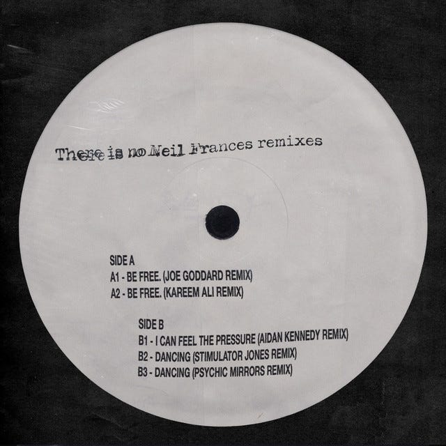
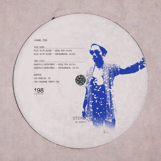
Browsing through dance playlists on your preferred streaming platform, you’ll also find many artists literally referencing the vinyl label as the entire cover. While the reference is clearly harkening back to the original days of 12”, it sometimes forgets to also bridge the gap into the 21st century and make a mark of its own.

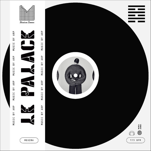
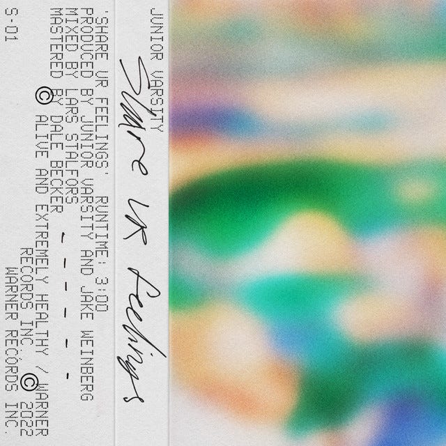
Another vinyl reference that has leaked into popular layouts is the packaging banner. Normally seen on top of the existing plastic sleeve, information such as record company, serial number, credits, etc are listed. In the digital age, it’s a nice default area to incorporate text into the layout.

But there’s also a point in design when the original reference can get lost as seen in the single art for Junior Varsity’s “Share Ur Feelings”. The footnote of the packaging banner is there, but the purpose feels vague accompanied by the gradient background, and too close to kin with the above Twin Peak’s cover. It’s hard to tell if Junior Varsity is bridging that gap into the modern age previously mentioned, or again losing the historical reference with a nostalgic millennial trend.
The Art of Cover Art is a free, educational, and inspirational resource. If you have $5/ month to spare it would be really helpful in furthering my research. Or, if you think a friend might enjoy this newsletter, the best way to pay it forward is by sharing!