The Simplicity of the Disco 12'' Single
The genre of Disco inherited its name from the French term “discotheque”, meaning a library of records, or what clubs, that played records instead of showcasing bands, began to be called in the late 60s/ early 70s. When listening to a Disco track, one can hear hints of Jazz and Latin, but what sets itself apart from its predecessors is its lengthy hypnotic tracks that go on for minutes at a time, cue Donna Summer’s “Love To Love You Baby” at 16:48.
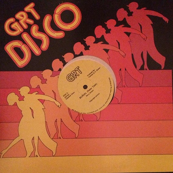
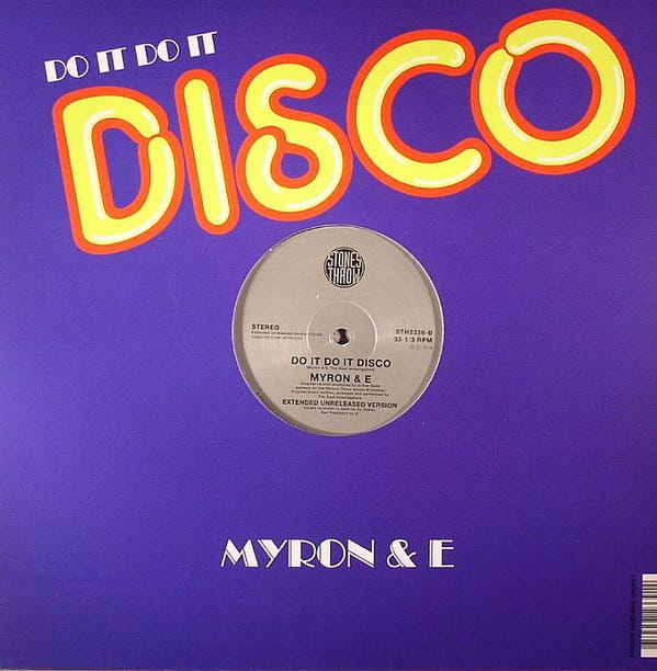
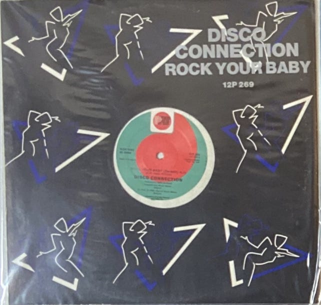
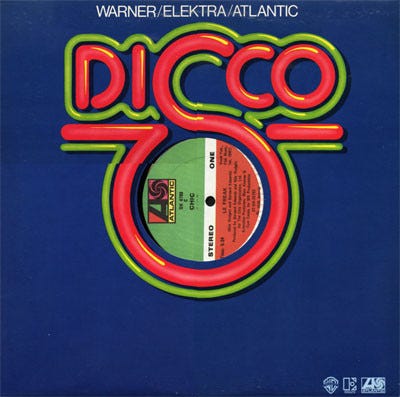
The culture surrounding Disco is dance-infused. From the mesmerizing lights to the gyrating movement on the club floor, audiences across the country and the world were losing themselves to Disco in the 1970s. And the genre’s album covers mimicked that fascination. From vibrant colors to sexual innuendos to electric illustrations, a Disco record will make itself known in a bin, even an anonymous 12-inch single.
The 12-inch single came to popularity during the height of the Disco era due to their extended lengths, giving DJs the ability to mix and easily transition between tracks. With the fast-paced energy of the club scene pumping out single after single and the novelty of the one-off pressing primarily made for DJs, and not consumers, the necessity to make album art wasn’t as high as for an LP. But within this subsector still came a visual niche for the Disco 12’’ single sleeve.
Most 12’’ singles are usually dressed in just a stark black or white sleeve with minimal, if any, bold text, with the same design on the front and back. The almost non-existence of an album cover became the look for a 12’’ single. Some designers, with the blank slate and artistic license, gained inspiration from the movement seen on the club floor and created graphic cut-outs of dancers to decorate their single sleeves. Others would crop in closely on lips and legs to exaggerate Disco’s infamous sex appeal. To abstract things even further, geometric lines also came to represent movement on many sleeves and labels. Ironically, these layouts would become generic, used multiple times within record labels for all of their singles, the artist credit of the original designer getting lost in the mix.
I’m looking for The Art of Cover Art to be a free educational and inspirational source since there is little documentation on the art history of album art. But, if you have $5/ month to spare, it would be super helpful in furthering my research. Or if you think a friend might enjoy this newsletter, the best way to pay it forward is by sharing!


