Physicality in Design: Anecdotes from Will Work For Good, a Creative Studio
Co-founder Kevin O'Neill walks us through the design studio's collaboration with record label RVNG Intl.
Over the past 20 years, Will Work For Good (WWFG), a design studio founded in 2007 by Kevin O’Neill and Karisa Senavitis, has designed the album art for every release on RVNG Intl. A Brooklyn-based independent record label, founded by Matt Werth, RVNG Intl., prides itself on carefully curated music that nurtures the audiophile community. Releases from experimental and avant-garde artists like Helado Negro, Kate NV, and Holly Herndon, among others, decorate the discography. WWFG and RVNG look to abstract music’s digital sphere and remind listeners of the sonic and visual physicality of music. Below, Kevin of WWFG talks us through their creative process and shares anecdotes of a few RVNG releases.
In 2007, Karisa and I worked at a design studio in New Jersey, quit together one day, and registered WWFG that evening. “Good” was kind of a popular word at the time, but we always thought of “for Good”, in our case, to mean “forever” implying a permanence, which is why we sometimes set it with an infinity symbol (ww∞).
Shortly after this, we moved outside of DC to Takoma Park, MD (John Fahey’s hometown), where we found our first home for WWFG down the road in Silver Spring at Pyramid Atlantic Art Center (they still use an icon we designed). Over the years, we’ve relocated to Brooklyn, Maastricht, NL (where Karisa held a residency at the Jan van Eyck Academie), Philadelphia, and back to NJ. We’ve always been a mostly home-based practice working in small spaces.
I started working with Matt before RVNG and WWFG existed. The first thing I worked on with him was a layout of some friends’ CD released on an earlier label he ran. At the time, I didn’t have a computer and was learning how to use QuarkXPress making ads with clip-art for Rutger’s campus newspaper. I would go there on weekends to put the layout together.
Matt comes from a really DIY background and ethic, and I think it’s been crucial to remember and express that. It’s maybe more literally apparent in some releases than others, but I like to believe that essence is always floating around in what we do. I think many of the artists making music with the label live or have lived in some kind of DIY mode, as well. That said, we try to keep our process fairly uncomplicated and design with what we have available.
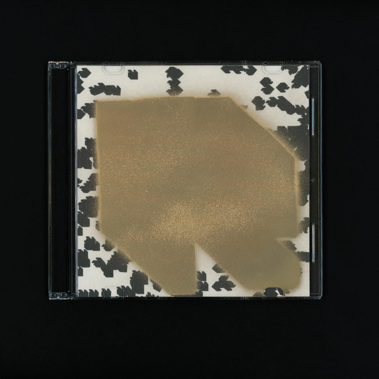
MX1B (2003), Rvng Prsnts Mx1B: Julian S. Prcss
Growing up, I didn’t know there was a profession called “graphic design,” but a few years later, when I started learning about design, I realized that the spray-painted, stenciled cover of Antioch Arrow’s The Lady Is A Cat was a knockoff of the Saul Bass graphic for Otto Preminger’s The Man with the Golden Arm. Although a lot of my records at the time were packaged in handmade covers (usually screen-printed on envelopes, colored papers, or paper towels), this one, on a folded piece of chipboard, had me most aware that a person made it, and thinking about how they made it. I like that the work of a legendary graphic designer still resonated and felt cool through this second-rate, degraded execution. Ten years later RVNG released its first mix cd in a slim-line case with a simple black and white insert printed at Kinko’s and a RVNG “R” logo stenciled and spray painted on the case.
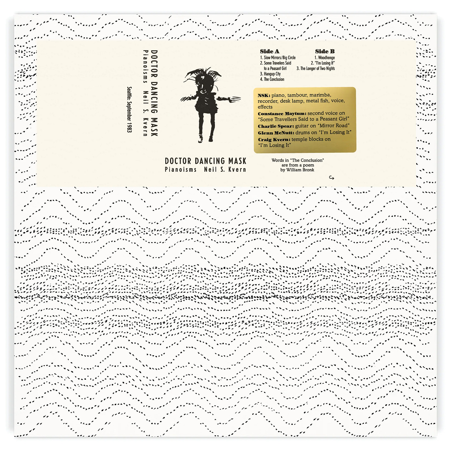
FTS026 (2023), Neil S. Kvern – Doctor Dancing Mask – Pianoisms
This is from the Uncommon¢ series of re-issues that WWfG designs for Freedom To Spend (a RVNG family label). This LP combines a gold label “patch” that also happens to be the correction to a last-minute credit edit.
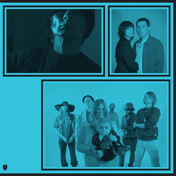
FRKWYS02 (2009), Excepter — FRKWYS Vol. 2
This cover is reminiscent of Folkways releases of the past. A 16x12in wrap on a leatherette jacket, but the choice of no text on the cover, paper color, and stroke weight around the photos, is more specifically a knockoff of a 60s Doo-Wop compilation.
RVNGNL43 (2018), Oliver Coates — Shelley’s On Zenn-La
Oliver was interested in having a cover with asemic writing. Coincidentally, I was dealing with a multiple sclerosis relapse at the time and lost much of the fine motor skills and strength I needed to hold a pen, marker, or write. These marks represent what my right hand was capable of at that time. It’s improved a bit since.
RVNGNL27 (2014), Bing & Ruth — Tomorrow Was The Golden Age
David (of Bing & Ruth) provided some brief notes on his thoughts regarding the artwork. He suggested not having text on the cover but also kept an open mind about the possibility of text. This led to us featuring empty blocks, which created available real estate for the artist's name and album title.
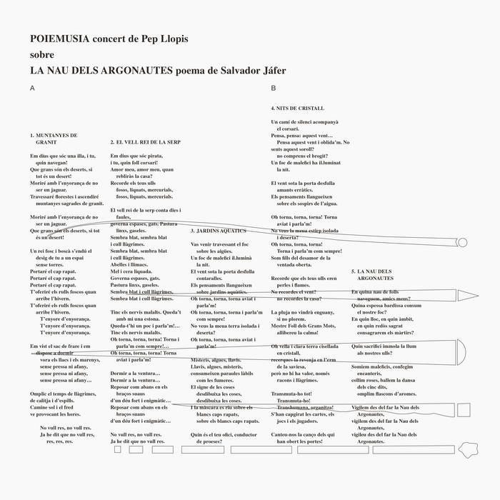
FTS003 (2017), Pep Llopis — Poiemusia La Nau Dels Argonautes
The idea for Freedom To Spend releases is to reinterpret covers (rather than reproduce) for a reentry into the world. For this re-issue, we transplanted the Spanish and Portuguese lyric sheet to the cover over a ghost of the original art, resetting all of the type and making a few text edits thirty years later.
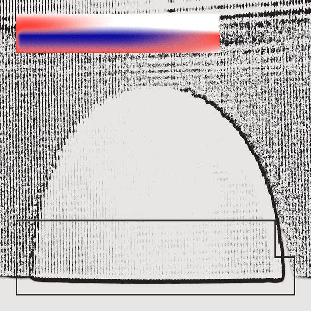
RVNGNL79 (2022), Diatom Deli — Time~Lapse Nature
An abstracted, cropped edge of the hand photograph featured on this cover can be found on a RVNG album released seven years earlier.
RVNGNL63 (2020), Kate NV — Room For The Moon
After some unsuccessful back and forths, the idea for this cover popped into our heads and was executed in about an hour. The white moons were torn from black construction paper.
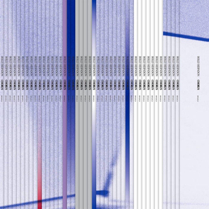
RVNGNL24 (2014), Holly Herndon — “Chorus”
Similar to Kate NV’s Room for the Moon, this was another cover where, once the idea came, it was executed extremely fast. In this case, we wanted to express the various voices that made up “Chorus” by producing a cover of spines. The bigger challenge was in the hands of the printer to deboss a series of vertical lines, helping to further the illusion of spines.
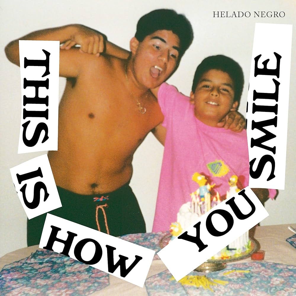
RVNGNL54 (2019), Helado Negro — This Is How You Smile
Roberto sent a small birthday pic of him and his brother. We imagined a cut-up black and white bumper sticker of the title arranged into a smile. As a bonus, the album included an alternate TIHYS bumper sticker which in turn was cut up and arranged into the cover of Helado Negro’s next RVNG release Live at KCRW.
The Art of Cover Art is a free educational and inspirational resource. If you have $5/ month to spare, it would be very helpful in furthering my research. Or, if you think a friend might enjoy this newsletter, the best way to pay it forward is by sharing!


