Did Folkways Records Move American Pop Art Forward?
How the designer Ronald Clyne and team were ahead of their time
The historic Folkways Records was founded in 1948 by music executive Moe Asch in New York City. The label released a diverse array of recordings from folk and blues musicians, to field recordings, to children’s lessons. Their mission was to “document the entire world of sound.” While varied in discography, what made the company distinctive was its cohesive album art that tied all of its titles together.
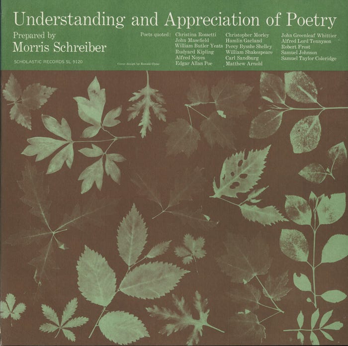
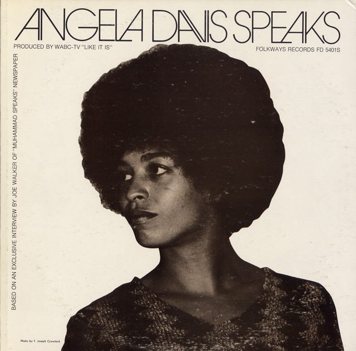
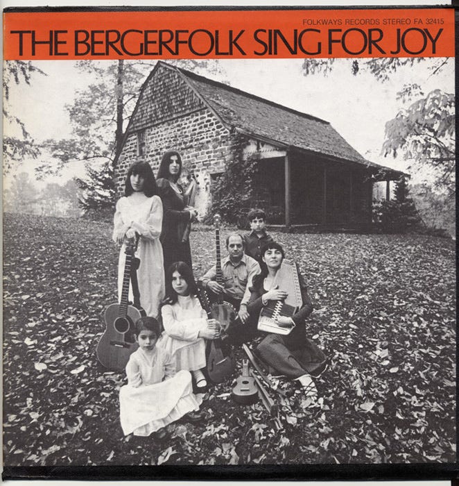
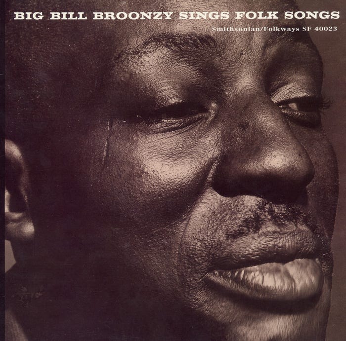
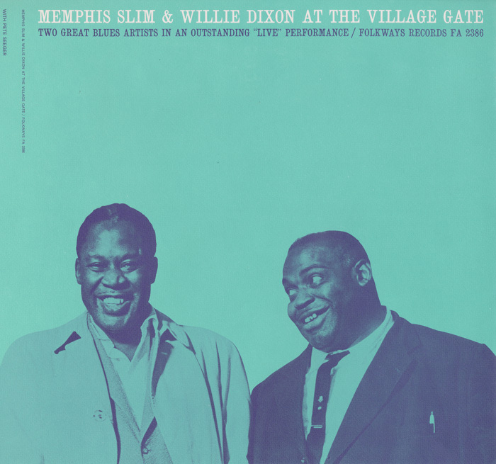
When describing a Folkways cover, one doesn’t need to list many adjectives. It’s minimalist in its use of typography, which is flush against the top edge, allowing the listener to be entranced with the photograph that is most likely front and center against a solid background, if not taking up the whole 12 by 12-inch square. The color palette is monochromatic, a result of the two-color printing on a matte cardboard paper stock utilized by Folkways, more for financial reasons than artistic ones. But as a result, created beautifully deep soft tones.
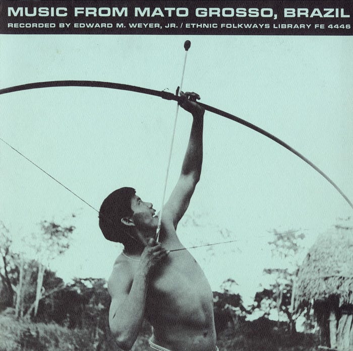
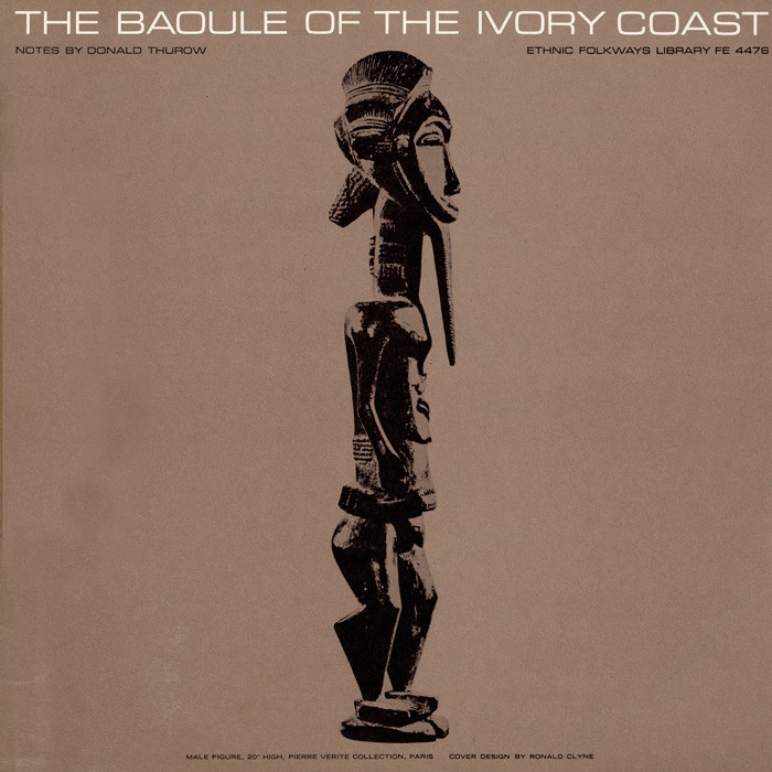
This look is in part due to Folkways designer, Ronald Clyne. He first began working for the label in 1949, but it wasn’t until the early 50s when his famous use of negative space and emphasis on photography became a staple of his work, which has since influenced a generation of record covers. Other acclaimed Folkways designers such as Craig Mierop, Irwin Rosenhouse, and David Stone Martin also helped push this aesthetic forward.
Around the same time in the mid-50s, an artistic movement called Pop Art was making headway in Britain. Artists were no longer inspired by the classics they had been learning in school and turned to imagery from their everyday lives ie. advertising, products, and movies. The movement soon made its way to America, which created two separate Pop Art classes. British Pop was interested in American culture from afar, while American Pop drew inspiration from experiencing the culture firsthand. In 1957, British artist Richard Hamilton described Pop Art as:
Popular (designed for a mass audience), Transient (short-term solution), Expendable (easily forgotten), Low cost, Mass produced, Young (aimed at youth), Witty, Sexy, Gimmicky, Glamorous, Big business
By 1957, Folkways Records had been around for almost a decade, producing records for a mass audience at a low cost. Like the Pop Artists, Clyne and fellow designers were also inspired by the imagery around them and often utilized public domain photography to include on the covers. In 1949, newcomer Andy Warhol had just had his first illustration published in Glamour magazine. But it wasn’t until 1961 when he created his first “pop painting” of a Coca-Cola bottle and in 1962 that he began photographic silkscreen printing, experimenting with the portraits of Marilyn Monroe and more.
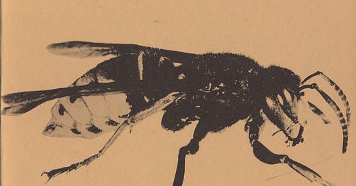
When looking at the works of Clyne and Warhol side-by-side, the relationship is undeniable. The printing techniques that both artists use create a high contrast look that further emphasizes the large scale of the imagery. A bee and a banana on their own would normally be banal, but the exaggeration of each creates a bold and eye-catching record cover. The only difference is that Clyne’s album on the left was created six years prior to Warhol’s infamous banana cover.

While Clyne and the other Folkways designers could’ve very likely been inspired by the British Pop movement, the time between the origins of the record label and the height of the American Pop movement is almost fifteen years in change. Music itself was a main source of inspiration for Pop Art, and as it became more readily available to consumers in the form of records, Folkways Records was sure to have been seen by artists with its release of 2,000+ titles in the time that Asch was alive until 1986. And as the Pop Art movement grew to its height of fame in the mid-60s and became an indispensable part of modern art, Folkways’ aesthetic only leaned more into the visual trends of the time, while still maintaining its cohesive look from its origins.
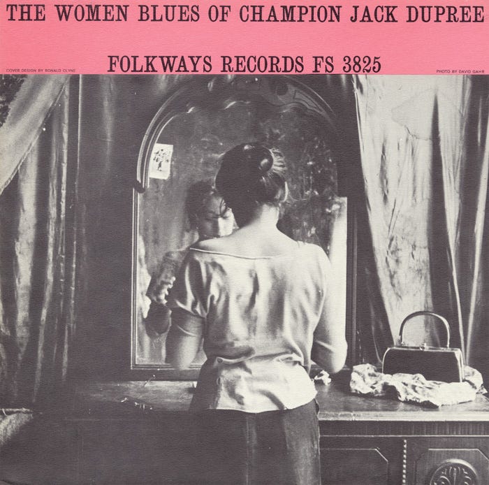
Below are a few more Folkways covers throughout the years.
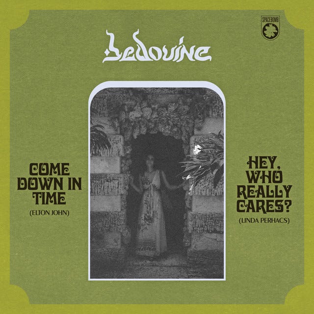
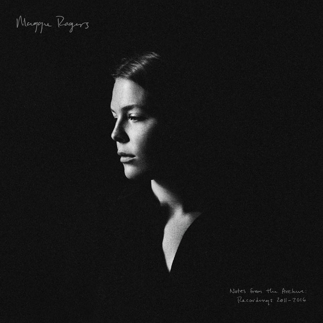
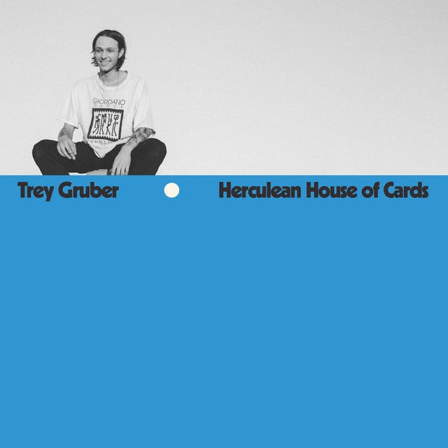
Along with albums from the last decade that have been influenced by Folkways.

I’m looking for The Art of Cover Art to be a free educational and inspirational source. But, if you have $5/ month to spare it would be super helpful in furthering my research. Or if you think a friend might enjoy this newsletter, the best way to pay it forward is by sharing!

