The Art of Cover Art is and will continue to be a free resource for all readers. If you have the means this month, consider upgrading to a paid subscription to support my work. A small donation to my ongoing coffee fund is also always appreciated. Happy reading!
I’ve missed writing this newsletter like I’ve missed an old friend.
Lately, life has been filled with lots of record covers, more making than writing, which is what I’ve been working towards these past few years. The active creation of album art is always exciting, yet I also cherish the serendipitous act of stumbling across new inspiration, references and baking them into this publication just as much. But with all of this making and doing, these chance encounters have been few and far between these days.
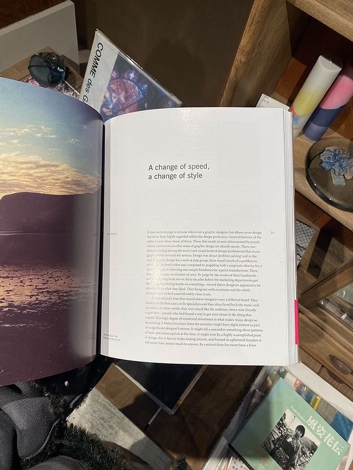
I’ve been reminiscing about how, back in February, I happened upon an overpriced copy of Designed by Peter Saville in a Japanese market. While I didn’t end up purchasing it, I became so enraptured with one essay in particular that I snuck a photo of it until I could afford it later.


A few years into starting this newsletter, Frank, a subscriber, emailed asking if I was familiar with the German record label ECM and their book anthology, Sleeves of Desire. He graciously shared a PDF copy of it with me, which went on to inspire this piece on Barbara Wojirsch, the incredible designer behind the label’s discography. The urge with which I would also love to own this incredible book…
And most recently, while having coffee with a new designer friend, Nola, I was introduced to this incredible essay by Ian F Sevonius on the work of fine artist Curt LeMieux. Deep within his writing, Sevonius draws the parallel between World War II and the record, a conceptual pair that had never entered my mind before.
So, below I share excerpts of these essays with you as a way to say hello to an old friend, satisfy a creative itch and hopefully share an inspiring discovery for you, the reader. Feel free to return the favor in the comments below with any books or pieces that the community might enjoy.
Designed by Peter Saville, Rick Poynor (2003)
“It may seem strange to anyone who is not a graphic designer, but album cover design has never been highly regarded within the design profession. General histories of the subject never show many of them. Those that sneak in were often created by people whose reputations in other areas of graphic design are already secure. There was always a feeling among the more hard-nosed kind of design professional that music graphics were not entirely serious. Design was about ‘problem solving’ and in the case of a cover design for a rock or pop group, there wasn’t much of a problem to solve. It all seemed rather easy compared to grappling with a corporate identity for a multinational, or churning out sample brochures for a paint manufacturer. There was also, perhaps, an element of envy. To judge by the results of their handiwork — and this is going back two or three decades before the marketing departments got their cold, calculating hands on everything — record sleeve designers appeared to be allowed to do what they liked. They hung out with musicians and the whole arrangement looked uncomfortably close to art.
It was certainly true that record sleeve designers were a different breed. They tended, in the best cases, to be specialists and they often loved both the music and its milieu. In other words, they were much like the audience. Some were literally super-fans — people who had found a way to get even closer to the thing they craved. This high degree of emotional investment is what makes music design so fascinating. A Dulux brochure from the seventies might have slight interest as part of a significant designer’s oeuvre. It might tell a researcher something about patterns of taste and consumption at the time. It might even be a highly accomplished piece of design. But it has no wider, lasting interest, and beyond its ephemeral function it will never have meant much to anyone. By contrast there has never been a form of graphic communication so densely charged with private signals, so personal and intimate, or so inseparably fused to the sense of who you are, as the album cover. Posters come close, perhaps; you live with them and they become part of the scenery of your life. Book covers, as graphic objects, have something in common. There is a sense of physical connection: you handle the book to read it, though once it is finished and shelved it may never be looked at closely again. But book cover designs are not tethered to their contents and no one minds too much when they are periodically revamped. With twelve-inch record sleeves, it was quite different. Whenever you played an album, the cover made a reappearance. Naturally, the music was the point of the exercise, but precisely because the musical experience was so intense and meaningful, the packaging that housed it became an object of desire. Its large size helped to make it a mood-setter, a contemplative aid, a vivid statement of artistic intent in its own right. Flipping through the racks in a record shop, it was often the first thing you absorbed about an album. Pink Floyd’s Atom Heart Mother (1970) was that cow in the field. The Mothers of Invention’s Weasels Ripped my Flesh (1970) was that grinning idiot mutilating his face with a weasel-razor. And Joy Division’s Unknown Pleasures (1979) will always be those mysterious, white waveforms set with hair-raising precision in a pool of inky blackness.
Peter Saville is unusual among designers who came to fame by creating album covers in never seeming to care that much about the music, even if he enjoyed the scene. It is hard to find an early interview in which he mentions the music as sound. He liked Orchestral Manoeuvres in the Dark, but appears to have had mixed feelings about early Joy Division, though he recognized Unknown Pleasures as an important record. Certainly he never came across as a rock and roll person or a fan. Yet that slight detachment — even though he sought out Tony Wilson to offer his services and became a founding partner of Factory — was central to what he achieved.”
“Looking at the Cover” by Steve Lake from ECM: Sleeves of Desire (1996)
“For no matter how powerful an image may be and how pure the intentions of the graphic artist (who may hope only to present a strong picture), the meaning of the work is changed when brought into the context of the cover. This is not merely a question of shrinking or, much less frequently, cropping a picture to fit the 12"x 12" LP format or the more restricting surface area of the CD booklet. When an album's title becomes a photo caption, it immediately modifies the signal that the image transmits. The image, meanwhile, guides us, directly or obliquely and whether we like it or not, to the nature of the music. It may even change the way we hear it.”
“Heroes: The Painting of Curt LeMieux” by Ian F Svenonius (2024)
“The record's preeminence as popular art actually coincides precisely with the time parameters of the "Cold War." The Cold War (1948-1991) was the ideological confrontation between the capitalist "west" and socialist "east" which manifested as a series of proxy wars, revolutions, and decolonization movements in Africa, Asia, the Caribbean, and Central America. It began with the end of World War II and ended with the capitalists victorious, demolishing their Soviet nemesis and absorbing USSR & PRC as imperial conquests.
Though the Second World War officially ended in 1945 with the Soviets marching into Berlin and the Americans with the atomic destruction of Hiroshima and Nagasaki, the battle lines for the next conflict took a few years to sort out. With the defeat of the Greek E.L.A.S. communists in the Greek Civil War (1946-1948) and the victory of The People's Liberation Army in China (1948), the stage was set and the Cold War officially commenced.
1948 was also the year that the long-playing record was invented. Before this, records had been 10 or 7 inches and had played at 78 or 45 rpm, meaning they were smaller, shorter and better served for singles and novelty. With the advent of the LP, which played at 33 rpm, up to 45 minutes of sound could be stored and the record cover was larger; this meant the medium invited more seriousness and a wider range of expressive possibilities.
Due to the invention of nuclear missiles and the promise of M.A.D. or "mutually assured destruction", the super powers never engaged in direct conflict, so the Cold War conflict took the form of influence; mostly in the so called Third world, with the Soviets sponsoring revolutions in Nicaragua, Cuba, and Vietnam for example and the USA assassinating and overthrowing elected leaders in Iran, Chile, Guatemala, Congo, et al.
The other ideological front was cultural, with vast resources spent on advancing art, music, dance, & film which was supposed to show the superiority of the ideological system which created and expounded it. The Soviet ethos was typically the idea of proliferating so-called "high culture" - ballet, classical, etc —to the masses, while the Americans focused on promoting "vulgar" or proletarian art forms - jazz, blues, commercial art — as high culture, which slyly espoused bourgeois ideology. The record album - and its sleeve- would be the principal form of Western propaganda throughout the Cold War.”
The Art of Cover Art is a free educational and inspirational resource. If you have $5/ month to spare, it would be super helpful in furthering my research. Or, if you think a friend might enjoy this newsletter, the best way to pay it forward is by sharing!


