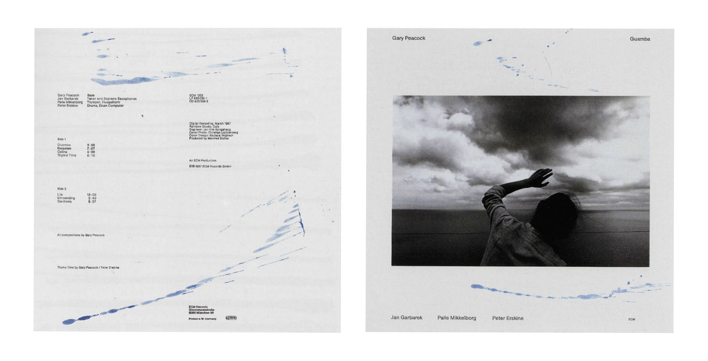
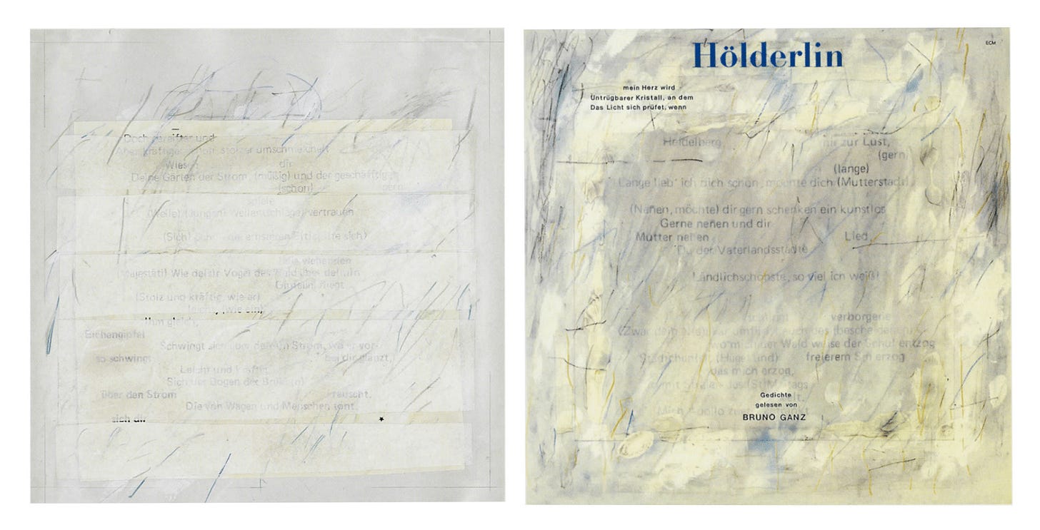
The Designer Behind the Visual Identity of ECM: Barbara Wojirsch
How grief and clarity shaped the unmistakable look of ECM Records
Editions of Contemporary Music, famously known as ECM, was founded in 1969 in Munich, Germany, by producer Manfred Eicher. An improvisational label “rooted in unflagging artistic conviction,” as described by writer Adrian Shaughnessy in the Summer 2010 issue of Eye. Within its 50+ lifespan, ECM currently boasts over 1700 records by the likes of Meredith Monk, Keith Jarrett, Steve Reich, and Chick Corea, among many more. While the abstract catalog has brought the label critical acclaim, its success can also be attributed to its unmistakable minimalist and meditative album covers designed by not-as-widely-known visual artist Barbara Wojirsch.
Barbara first began creating covers for ECM in partnership with her husband, Burkhart Wojirsch, in 1970. Credited on layouts as B. & B. Wojirsch, the couple collaborated until the untimely death of Burkhart in the mid-70s. Still, Barbara continued their creative practice with Eicher and ECM.

Simplicity, reduction, and silence were keywords of Manfred and Barbara’s aesthetic vision for the label. Painterly gestures, muted color palettes, and textural surfaces are just a few of the design motifs Barbara employed that accomplished this concept. In the printed 1996 anthology Sleeves of Desire: A Cover Story, Barbara spoke of her design practice. “Being impressed by the sheer quantity of things and messages day in and day out makes me want to remove as much as possible from my designs until only something essential, only a thought or a gesture, remains.”
Reading her thoughts and empathizing with the grief she must have experienced after her husband’s death adds a poetic weight to the covers she continued to create for ECM. Juxtaposed alongside her earlier designs with Burkhart, we see Barbara leave the large typography and bold textures they created together behind in exchange for a reflective lightness. Looking at the covers Barbara designed between 1975 - 1977 in the early years after Burkhart’s death, we see her let images speak for themselves. The purposeful negative space translates just as powerfully as her soft pen markings. The covers almost feel like we’re peering into personal memories.

As Barbara continued to work for ECM, the label and her design practice evolved. Her use of negative space and minimal type remained, while her painting roots and modern art influences began to shine through with her use of crayon markings and layered brushstrokes. In 1978 photographer Dieter Rehm joined the team and complemented Barbara’s reflective aesthetic with cinematic and emotional images. The addition of Rehm began the trend of using photography across most of the label’s covers going forward. By the time Barbara retired in the mid-1990s, she had cemented the look and feel that so many associate ECM with today.
While Eicher and the label still continue to operate and collaborate with talented visual artists, one can’t help but notice Barbara’s absence. In the same piece for Eye, writer Adrian Shaughnessy similarly laments, noting “ECM’s drift towards the anodyne” in 2010. While Manfred Eicher is responsible for the ethos and vision behind the label, I felt it incredibly important to highlight the woman who visually brought the music to life.
Find more of Barbara’s work below:


Special thank you to one of my subscribers, Frank Gross, who graciously shared a copy of the sought-after Sleeves of Desire ECM anthology with me. This newsletter wouldn’t have been possible without it!
The Art of Cover Art is a free educational and inspirational resource. If you have $5/ month to spare, it would be very helpful in furthering my research. Or, if you think a friend might enjoy this newsletter, the best way to pay it forward is by sharing!


I did not know Barbara Wojirsch's name until now, so I am very grateful for you bringing her work to my attention. What a lovely publication you have here. I look forward to reading more.
ECM covers are amazing, I own a bunch that I don’t even listen to, just like the covers! Plenty more have excellent covers and good music.
Thanks for the insight.