Tracing the Art School Lineage of Post-Punk Heroes Wire
Exploring the creative packaging of the 70s English post-punk group
Art school is responsible for many of music’s great names and visuals. We can thank the Rhode Island School of Design for the Talking Heads and their art rock legacy. More accolades can be sent to Croydon Art School for Jamie Reid and his radical visuals behind the Sex Pistols’ "God Save the Queen." Ealing Art College awarded both Freddie Mercury and Pete Townshend degrees in Graphic Design. And in 1976, at Watford College of Art and Design, guitarist Bruce Gilbert and vocalist Colin Newman formed the hailed post-punk group Wire.
By 1977, punk had made its mark. According to Jon Savage in Punk 45: The Singles Cover Art of Punk 1975-80, “Any punk group that moved was signed. The basic templates of punk design thus far - ransom note lettering, torn paper, Xerox culture, urbanist scenes, and photomontage, among others - were enthusiastically taken up by the major labels.” If punk was a reaction to the current establishment, Wire and post-punk was a reaction to the aesthetic that had been commodified by the majors.
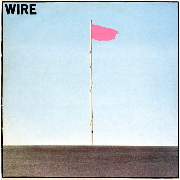
Just like one’s educational journey in art school, the members of Wire learned the rules and subsequently broke them. Instead of rough, in-your-face art, the group produced experimental leftfield punk music packaged in refined yet edgy designs. Bruce, a painter, and bassist Graham Lewis, a fashion designer, ideated the imagery for their 1977 debut album, Pink Flag. They introduced pastel colors, with a solid stroke of pink paint on a grainy photograph of a perfectly centered pole in a vast, empty environment with a light blue sky. The multimedia cover is simple yet striking, leaning on negative space to draw the viewer in.
Gilbert and Lewis are credited with concept ideation on several other Wire albums, including Chairs Missing and 154. According to the official Wire website, “Bruce and Graham consulted and collaborated closely on the visual identity of the group (record sleeves, posters, and stage design) and often when writing texts, either individually or together.”
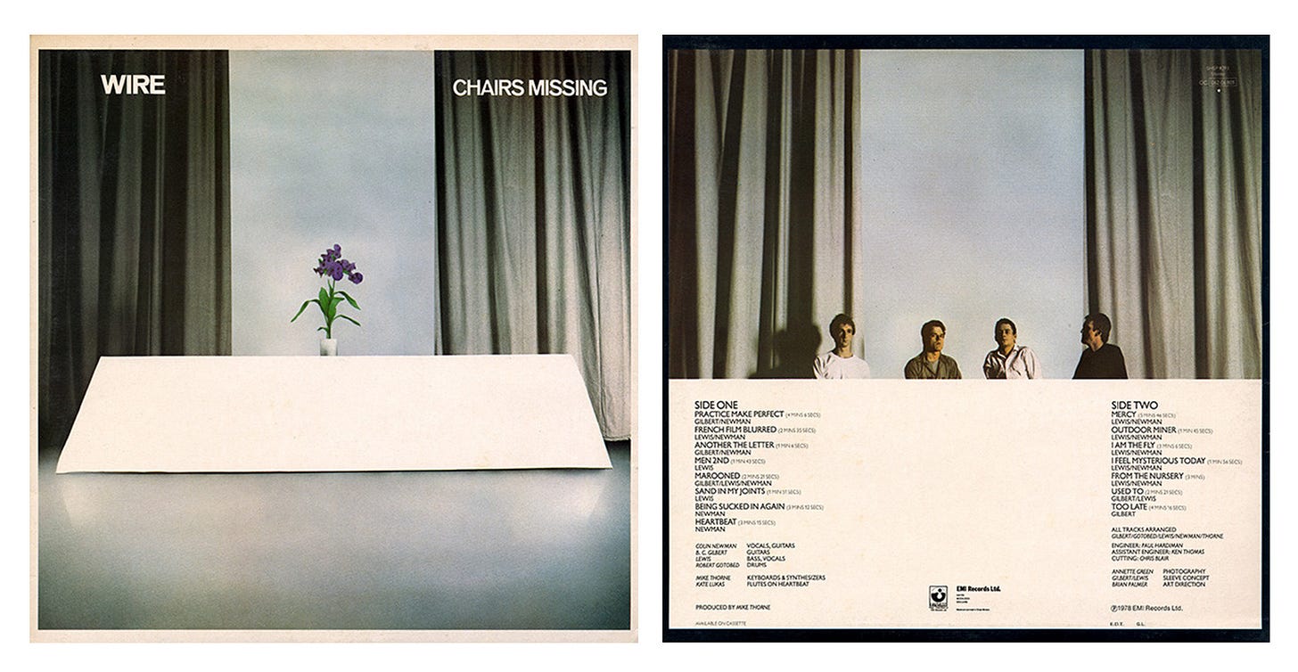
Chairs Missing mimics a similar layout to Pink Flag, with a central focus in mind. In this case, a vase of flowers sits in a deserted room flanked by curtains. The color palette is once again soft but muted. On the back cover, we find the band members within the same environment, the negative white space of the tracklist, and credits mimicking the distorted table. On 154, the band moves on from the static-centric aesthetic and experiments with movement, utilizing energetic squiggles and sharp lines. You can see this geometric spirit continue onto the cover and packaging of their 1981 release Document And Eyewitness, with a photo of dancers diagonally cut into strips to form abstract linework.
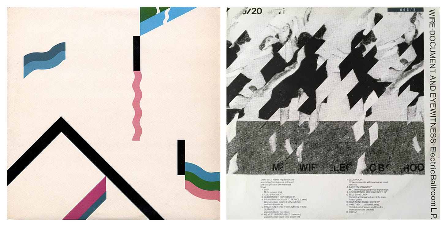
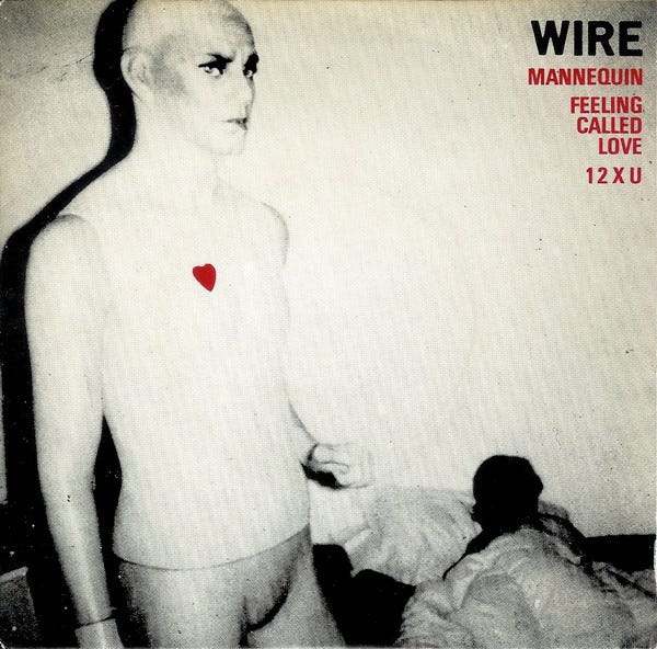
One of my favorite Wire covers is found on their 1978 single “I Am The Fly.” The cover feels like an ultimate Wire fan crossword puzzle. In the bottom row, we see the head found on their first single, “Mannequin,” the top left, we see a flag ala Pink Flag, and the DNA-like helix in the upper left-center nod to the geometric phase that is soon to come. The artist credit is unknown, so it could very easily be a marketing ploy devised by Harvest, but regardless, it seamlessly blends into the band’s self-fulfilled visual world.
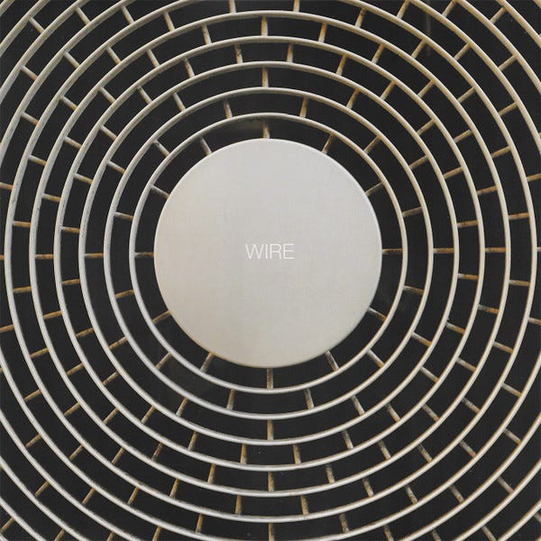
Find more Wire covers below.
The Art of Cover Art is a free educational and inspirational resource. If you have $5/ month to spare, it would be very helpful in furthering my research. Or, if you think a friend might enjoy this newsletter, the best way to pay it forward is by sharing!

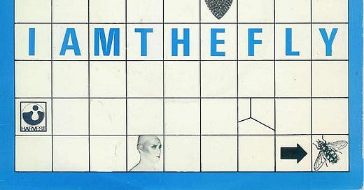


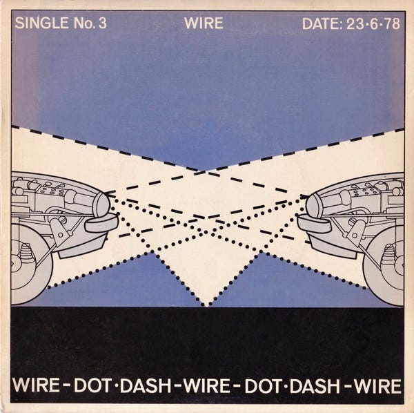
Amazing collection of work! On the I Am Fly artwork, I noticed some morse code at the top spelling out SOS. Might well be another link to their Dot Dash single? Super fun ✨
I love that Chairs missing cover. It’s as if Jesus Christ and his crew were a no-show for their last supper reservation - great piece