The Visual Romance Behind Fontaines D.C.'s New Era
In conversation with XL art director Texas Maragh on one of 2024's top albums
The Art of Cover Art is and will continue to be a free resource for all readers. If you have the means this month, consider upgrading to a paid subscription to support my work. A small donation to my ongoing coffee fund is also always appreciated. Happy reading!
In mid-April, Irish rock band Fontaines D.C. posted a photo on their Instagram captioned “Tomorrow.” The moody image shows the five-piece mixing leather with athleisure; eyes noticeably traced in heavy eyeliner. A hard pivot from their previous look of not really having a look, fans conveyed their confusion. Some referred to Green Day, comparing lead singer Grian Chatten to Billy Joe Armstrong. 24 hours later, the band announced their new album, Romance, alongside their signing to British pioneer XL Recordings, a big move from their longtime home at Partisan Records. Change was clearly in the air.
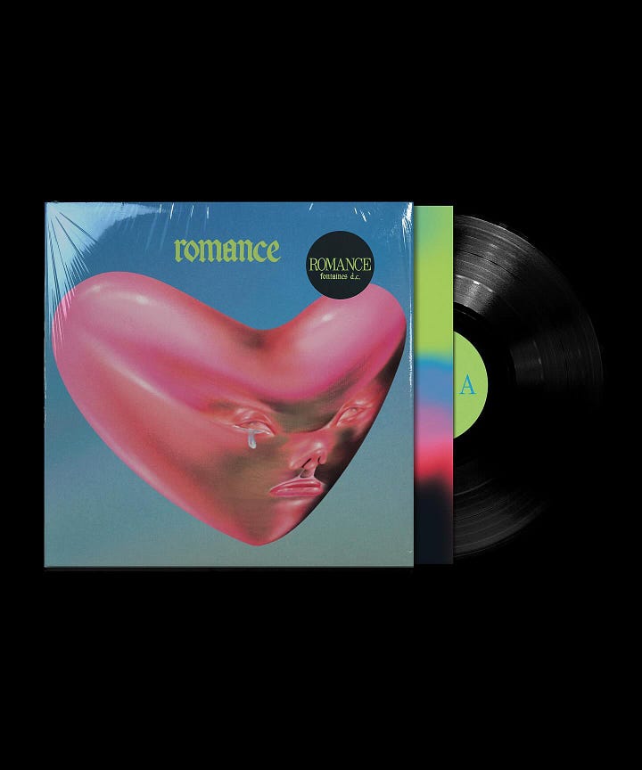
The album campaign began rolling out neon cover art by illustrator Lulu Lin, a viscerally intricate music video by director Aube Perrie, and an anonymous green figure on socials. Outlets began making connections to Korn, Smashing Pumpkins, and Alice in Chains as inspiration for the band’s new “considered, holistic aesthetic,” as described by The Guardian.

Whenever a band rebrands, I hold my breath. But looking back at the Romance campaign as the year closes, Fontaines D.C.’s new era is undoubtedly refined. In the current climate of worldwide protests, the group continues to hold pride in their Irish heritage, donning the symbolic balaclava of the IRA. While the press saw hints of cyberpunk, I see the influence of now label family The Prodigy (especially in guitarist Carlos O’Connell’s flaming pink hair). The photography from The Cure’s Pornography also comes to mind when looking at portraits of the members in the deluxe vinyl packaging. Many may associate neon green and 2024 with Charli XCX, but the Grammy-nominated rock band took a hue from their country’s flag and put their mark on it.
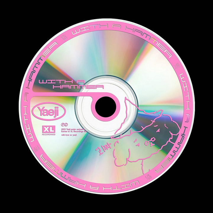
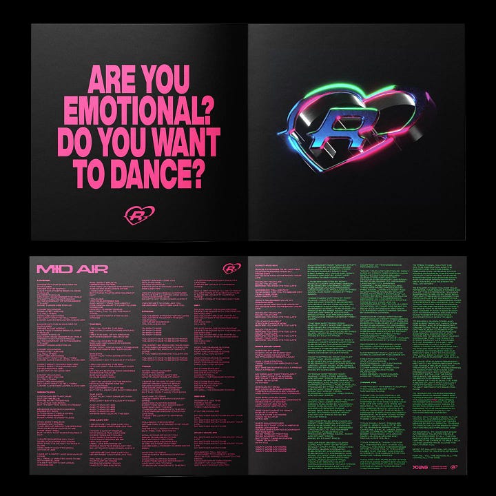
Alongside the band in their transformation was XL art director Texas Maragh. While she collaborated closely with Carlos, her stylistic touch is unmistakable. Browsing through her portfolio, her signature use of hot pink is found in work for Romy, Yaeji and Blawan. It continues to accompany the aforementioned green to form an acid color palette on the Fontaines D.C. packaging. Below, we get an in-depth interview with Maragh to learn more about the visual world behind one of 2024’s most beloved albums.


What is your first memory of design?
When I was younger I used to love neon signs in off licences, the bold colours and simplicity of London tube poster ads, and how satisfying tube maps were. And sneakers! I was obsessed.
Tell us about your creative journey leading up to working at XL.
I studied graphic communication at Central Saint Martins and started my career as a graphic designer in the fashion world, which was a great introduction to a fast-paced industry. I wanted to be more immersed in the world of design so a year later I joined a design studio. The studio worked with a lot of music venues, which was my first experience working in music. I helped with the branding and identity for venues such as OMEARA and Lafayette.
This sparked a passion for wanting to work in music so I started to collaborate with emerging artists like Enny on the side to build my portfolio. Off the back of that work, XL Recordings reached out for freelance help. I loved working on the project so much that it was the moment I fell in love with design for music. Around the same time, XL was looking for a designer so the stars aligned and here we are! I have worked at XL for three and a half years now and just recently started a new role as Art Director.
In an interview with the band back in April, The Guardian appropriately remarked Romance is "the first time the band have had a considered, holistic aesthetic." When a band comes to you wanting to take an aesthetic leap, such as Fontaines D.C. has done here on their fourth album, what is your initial creative process like?
As a creative team we want our artists to feel as comfortable as possible in bringing their ideas to the table. We are there to help them as much or as little as they’d like in realising their creative vision. We process their ideas by having discussions and brainstorms which help in establishing the running themes for the creative world which are often very inspired by the music-making process.
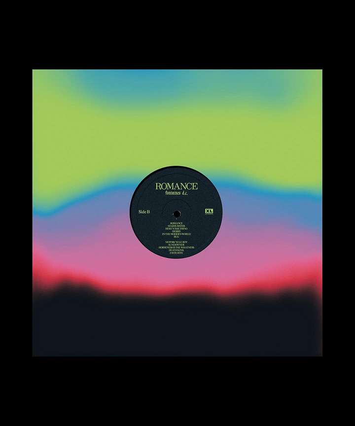
In NME, Grian mentioned "the colours that I hear in the music are not colours that you'd find in nature." In The Guardian, Carlos stated that the Romance songs made him "see neon green everywhere." How did you and the band land on the final color palette, which is such an unexpected departure from their past discography?
I think wanting a change from what had come before played a big role in a lot of the creative - the colours being a huge part. The music itself is different, and when listening to it, we were struck by how big it sounded, so we wanted to use bright acid colours to reflect that. Everything is heightened and loud.
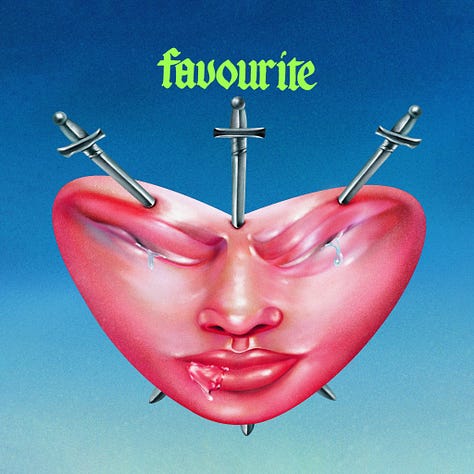

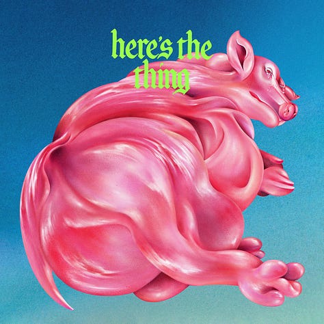
When did illustrator Lulu Lin's artwork come into the fold of the campaign? Was her work a point of inspiration or the answer to the dystopian-esque world you were building for Romance?
The work was definitely the answer. I suggested Lulu’s work after it became clear from having discussions with the band that there were some specific themes that we needed to bring into the creative world of the album. These included futurism, grotesqueness, uncanniness, romance, greed and gluttony. Working closely with Carlos, he sent us a specific brief to use those themes within the cover art.
The band was also interested in working with contemporary surrealist artists, specifically ones who worked across digital/non-digital worlds. Lulu’s work perfectly treads the line between the physical and emotional sides of romance. The style and approach of her work perfectly communicated the band’s ideas. The vibrant saturated colours, teary eyes, and distorted fleshy skin, all combined with the iconic romantic trope of a love heart shape, made Lulu’s artworks the perfect choice.
Amidst the shift, the one thing that remained the same was the font from Skinty Fia. Walk us through this decision.
Ash Willerton hand-painted the Skinty Fia font, so the typeface is unique to the band and has since been adopted as their logo font. For Romance, everyone was keen to keep an element of what had come before to anchor the new creative direction and nod to the past, but we updated it with a new colour palate to bring it into the new era. I created a new monogram logo using the font for the band which is used throughout the project and has appeared behind them on stage on their tour (lit up in pink and green, of course).


Outside trends are always out of our control. Charli announced her green Brat cover only a month before the cover of Romance was revealed. In August, It's Nice That dissected the medieval gothic trend in design. Do you think these trends inadvertently aided the campaign at all, modernizing the 90s influence?
Not intentionally, haha - the creative process for the album started late last year, and it was all very inspired by the essence of the music / new sound the band had created.
On the topic of outside influences, any fellow designers or creatives in the music industry whose work inspires you?
I’m always inspired by the artists and creators we work with, but also by things outside of the industry, like fashion and the visual worlds of sports, especially football and motorsports.
The Art of Cover Art is a free educational and inspirational resource. If you have $5/ month to spare, it would be super helpful in furthering my research. Or, if you think a friend might enjoy this newsletter, the best way to pay it forward is by sharing!



First time I saw this album in the record store I was captured by the artwork and wondered who did it…thank you for the beautiful storytelling and interview 🙏❤️⚔️
Such great insights into the world of album art direction - Ty 🫶