The Symmetry of ABBA
How the discography of the four-member pop group adopted the visual pattern
In 1972, four Swedes named Björn, Benny, Agnetha, and Anni-Frid released the B-Side single “He Is Your Brother / Santa Rosa.” The sound was a mix of pop and rock, with Björn and Benny’s vocals at the forefront, a slight deviation from the chart-hitting disco hits they would be known for creating nearly two years later as ABBA.
The ABBA acronym came from each member’s first initial, but the iconic logo came from the mind of designer Rune Söderqvist in 1975. Made up of two couples, Agnetha Faltskog and Bjorn Ulvaeus, and Benny Andersson and Anni-Frid Lyngstad, Söderqvist thought that the two Bs should face back to back, to create a symmetrical logo that conveyed the mirror-like composition of the group. From then on, Söderqvist went on to design every ABBA album.
While the idea of symmetry was cemented as the group’s branding and image with the logo in 1975, the inspiration had already existed in the band’s previous album covers. You can already see the repetition in the designs and group formation in Ring Ring, Waterloo, and their eponymous 1975 LP ABBA.


The pattern is subtle in its appearance. Ring Ring is in style with its hypnotic 70s aesthetic at the time, and Waterloo and ABBA only further emphasize the symmetrical being of the band. The repetition can be found in many areas. From the two couples to both Agnetha & Anni-Frid as center vocals to Benny and Björn backing the band as instrumentalists. Each member is unique in their role to the band, yet a mirror-image of their counterpart.
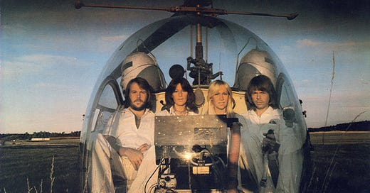
In 1976, the logo appeared on the group’s fourth studio album Arrival. Between the all-white outfits, long hairstyles, and the mirror design of the helicopter, Söderqvist avoids the symmetry overload by skewing the photo slightly to the right so as not to match the center-aligned text above.
And that’s what makes the symmetry of ABBA work. It’s simple and graphic, yet not overkill. The mirrored pattern can be executed in a myriad of ways. It can be seen in their performance, in their stage formation and choreography, and even in their music videos through their cinematography.
The art of symmetry is a mathematical one. In its purest form, it represents balance. But while Agnetha, Anni-Frid, Björn, and Benny might’ve appeared as the ultimate Disco group, the four members parted ways in the early 80s when the core symmetry of the group quickly vanished due to both couples divorcing.
On their last album before they disbanded, The Visitors, one can feel and see the separation on the cover. The four members sit in a darkly lit spacious room. They’re each apart from each other, a harsh juxtaposition to their previous covers where they were always shoulder to shoulder. Yet even within the dim environment, an eery sense of symmetry still exists, with Agnetha and Anni-Frid on the left and Björn and Benny on the right. Two columns, two groups of picture frames and two tables leave the women and the men in their own, separate, yet similar worlds.
Find more ABBA covers throughout the years below:

I’m looking for The Art of Cover Art to be a free educational and inspirational source. But if you have $5/ month to spare, it would be super helpful in furthering my research. Or if you think a friend might enjoy this newsletter, the best way to pay it forward is by sharing!


