The Evolving Art of Collage
From 12th Century Japanese Art to the Rolling Stone's Exile on Main St.
A few weeks ago while doing laundry in the basement of my building, I couldn’t help but notice a dusty box of records sitting in a neighbor’s open storage unit. Waiting for the dryer to finish, I rifled through, happening upon, not one, but two original pressings of Rolling Stones’ Exile on Main St. The double-vinyl album art features not only photographs by Robert Frank, but an extensive and beautiful collage layout by John Van Hamersveld and Norman Seeff. The front cover, while it may look like a collage, is the wall of a tattoo shop, a photograph from Franks’ The Americans. The photo became the inspiration point for the rest of the artwork. On the inserts, gatefold, and back cover, the collage style of the parlor wall is stylistically replicated with candid photos of the Stones.

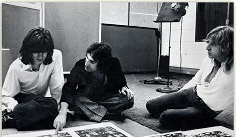
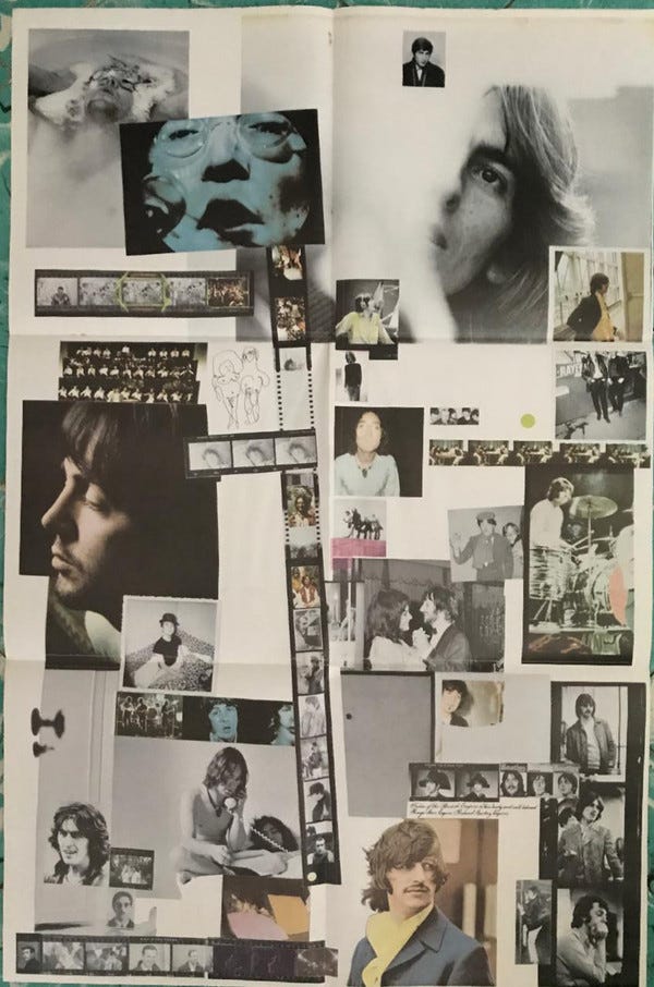
The artwork is gritty and punk in its exaggerated use of repeated imagery and Mick Jagger’s scrawled handwriting. It’s reminiscent of a contact sheet, a popular layout seen on many albums, but with a heavy dash of the band’s notorious raucous energy. On The Beatle’s 1968 eponymous studio album, famously known as the White Album, a similar style is seen on an included foldout poster. It features portraits of the members in the form of polaroids and film strips along with drawings and flashes of color (quite a juxtaposition from the purposefully blank album art). Just like Exile on Main St., images are skewed and overloaded, but with a much softer and nostalgic touch.
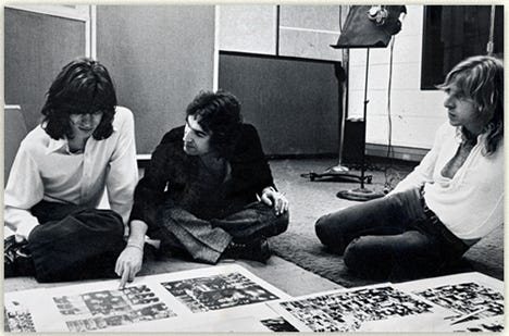
At the time these two albums and bands were gaining notoriety “anti-establishment protesters use[d] collage to propel agenda and raise awareness of political issues… the 20th century introduced an experimental kind of collage, stylistically evolving through each artistic movement,” the art platform Unframed notes. Each of these artists was propelling their own agenda through their music, and collage was the popular vehicle of choice.
Before the technique was used on album covers, collage as an art term came to popularity in the early 20th century during the Cubism movement. The word is derived from the French verb “coller”, meaning “to stick”. But the technique was first seen as early as the 12th century in Japan, where artisans glued calligraphy onto paper and attached paper to silk.
An almost interchangeable technique, mixed media, simultaneously grew to popularity with collage. Besides the contact sheet style, many artists utilized layering and cut-out techniques from paper, to photographs, illustrations, and life-size cutouts to create their album art.

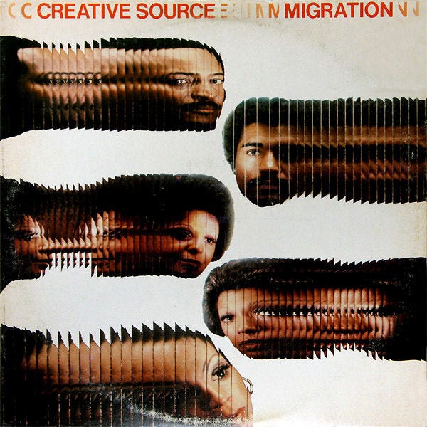
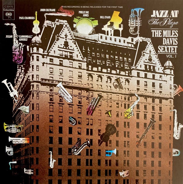

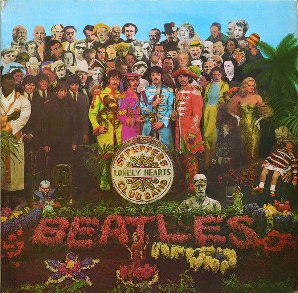

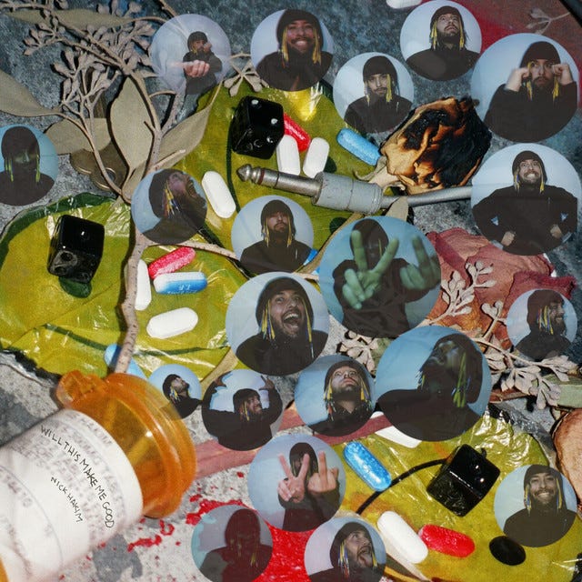
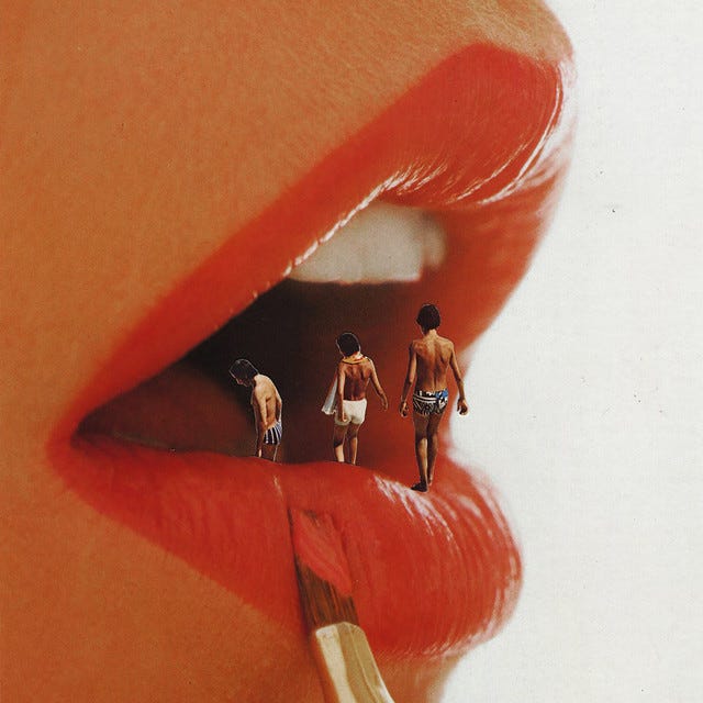
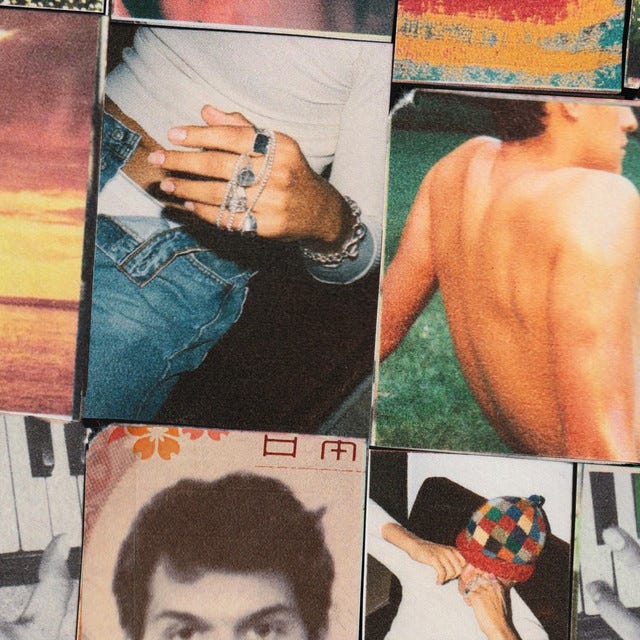
Today, artists are pushing the boundaries of collage even further. From dying, to wetting and burning photos to create warped textures, the analog process has made a surprising comeback in the age of Photoshop. Brothers Anton and Nikita Reva, in particular, have been leading the way in analog with their artwork, creating covers for the likes of Wavedash, Snny, Troye Sivan and Julia Michaels. Collage is undoubtedly having a moment, from indie to mainstream artists… The viral single of 2021, “Driver’s License” by Olivia Rodrigo even utilizes the trend with a ripped filmstrip-like banner layered on top of a portrait of the singer covered in projected text (another meta collage, if you will). Below are a few album covers from the past two years, showing how collage, while an old art, is still evolving into the 21st century.



I’m looking for The Art of Cover Art to be a free educational and inspirational source since there is little documentation on the art history of album art. But, if you have $5/ month to spare, it would be super helpful in furthering my research. Or if you think a friend might enjoy this newsletter, the best way to pay it forward is by sharing!

