In a 2017 article, Forbes stated that the average American comes across a minimum of 4,000 ads a day. Fast forward to 2021, and that statistic has only increased with the rise of social media. Logos, an integral part of any successful ad, have been around as early as the Middle Ages when upper-class families designed crests to represent their lineage. With education only reserved for the wealthy during that time, these pictorial symbols also came to represent shops and goods for those who were illiterate. With the invention of the printing press in 1440, and the Industrial Revolution four centuries later, mass communication and consumer economy aided the growth of the logo. With more consumers able to buy, more retail shops were born, all looking to differentiate themselves from their competitors.
And while music has always been an art, bands and labels have been selling their brands since the birth of Rock n’ Roll. The logo side hasn’t always been cohesive though. The Beatles only used their famous drop-T logo on one album cover, 1988’s Past Masters Volumes One & Two, long after the group had disbanded and Lennon passed, most likely a label decision. The Rolling Stones’ “sex sells” lip-and-tongue symbol wasn’t created until 1971, seven years after the band had made their mark and didn’t need a logo to differentiate themselves from the masses.
Many bands have changed their logos during periods of transition, whether it be sonically or aesthetically. British five-piece Judas Priest adopted its jagged cross-like logo in 1978 with the release of their fourth album Killing Machine. The logo, designed by Polish artist Roslaw Szaybo, coincided with a rebrand for the group, as they were transitioning into a new style and look. Black Sabbath has also gone through six logos since its inception, its two most recognizable, in uppercase and title case thick block lettering.

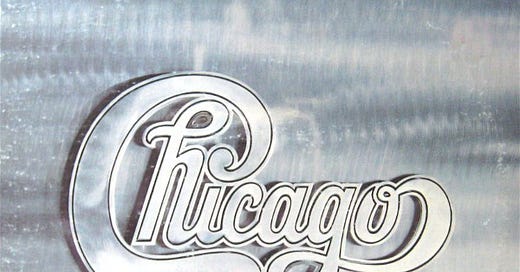
1970s rock band Chicago on the other hand has always had an iconic logo since its inception. Designed by New York-born designer Nick Fasciano, the logo has gone through two iterations. On their first three albums, when the band was known as Chicago Transit Authority, the same thick rounded cursive flows throughout the whole name. It was in 1970, when an impending lawsuit by the city of Chicago’s Transportation System, shortened the group’s name to Chicago, and Fasciano fashioned the logo into its most recognizable form with the help of designer John Berg.

Musical genres have created their own visual worlds as they’ve found their cultural niches. Heavy metal, in particular, aesthetically adopted a stoic and sharp look. Ramble off almost any metal band, and you’ll find that each logo has a fierce, jagged style to it. Los Angeles heavy metal band Metallica’s spikey blocked logo has been around since the band’s first cassette Live Metal Up Your Ass released in 1982. Designed by guitarist James Hetfield, the logo came into 3-D in 1984 on the cover of Ride the Lightning. Also early on in their career, New York rock band Kiss incorporated two lightning bolts into the two Ss of their logo, designed by former guitarist Ace Frehley.

Within the last few years, typography has become an essential visual component of any successful music campaign. But with our generation’s insatiable need for the new, long-lasting logos are beginning to fade into the background. Music icons, while they’ll always be classic, are continuously attempting to stay hip. Taylor Swift, from 2006 - 2010, sported her cursive, handwritten-like logo but dropped it in 2012 for a sans serif, no-frills block logo when she released Red, her first transitory album into pop.
These days the logo is now made more for the superfan than anyone else. Music enthusiasts want their favorite musician emblazoned on their clothing and walls. Swift’s successors Phoebe Bridgers and Maggie Rogers adopted the same organic, handwritten style as her 2006-2010 era. But when looking at their merchandise, Bridgers’ name appears in the aforementioned heavy metal aesthetic and Rogers’ in an array of ‘70s like serif fonts. Merchandise and posters have kept the need for branding alive, yet the inconsistency, albeit not a negative, begs to ask if the logo is becoming a vestigial organ for musicians and bands alike.
I’m looking for The Art of Cover Art to be a free educational and inspirational source since there is little documentation on the art history of album art. But, if you have $5/ month to spare, it would be super helpful in furthering my research. Or if you think a friend might enjoy this newsletter, the best way to pay it forward is by sharing!


