The Abstract Normal for Classical Record Covers
Exploring the Modernist visual influence on the traditional genre
After World War I, artists began experimenting with new ideas, subjects, and mediums as a reaction to the traditionalist ways of society. This period in art became broadly known as Modernism and includes many movements including Impressionism, Cubism, Futurism, and more.
At the same time as visual artists were being inspired by Modernism, so too were musicians. Around the world, musical artists and theorists like Igor Stravinsky, Dmitri Shostakovich, Arnold Schoenberg, and John Cage, among others, were creating avant-garde compositions from the traditional orchestral classical pieces. It was only a matter of time before the sonic and visual Modernist mediums crossed paths in the form of album covers.
From the beginning of the 1950s through the 60s, artists began further exploring the International Typographic Style, or Swiss Style, that had begun at the beginning of the 20th century. While the style was invented to convey messages in a clear and distinct way, designers accompanied the copy with bold colors and shapes, creating dynamic gestures in the process. Rudolph de Harak, a follower of the movement, but categorized as an American Modernist, applied many of these designs to the covers of the American classical label, Westminster.


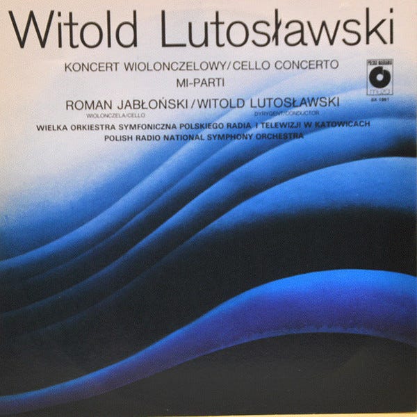
The Warsaw Autumn (Warszawska Jesień) Festival, founded in 1956 by the composers Tadeusz Baird and Kazimierz Serocki, also adopted this chapter of Modernist design. Organized by the Polish Composers’ Union, founded in 1945, the mission of the 9-day event was to introduce contemporary and avant-garde music to the world. Designers like Waldemar Świerzy and Hubert Hilscher helped propel the aesthetic forward with visuals that mimicked the soundwaves of the compositions.


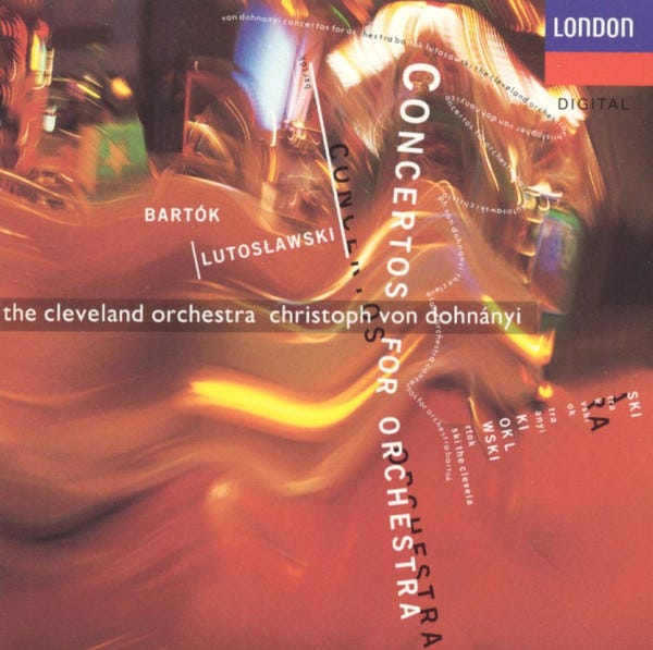
While Modernism fell out of style with the birth of Post-Modernism in the 70s, the era gave classical and avant-garde compositions a starting point for their record covers: abstraction. Later on, in the 80s we see the same visual archetype showcased, yet the idea of movement is presented in a louder state. Fast forward to the era of streaming, we see modern composers visualized through subtle, minimalist compositions. Modernism, and thus abstraction, has allowed a genre that doesn’t have a personal brand for composers or orchestras, an identity for it as a whole.


I’m looking for The Art of Cover Art to be a free educational and inspirational source. But, if you have $5/ month to spare it would be super helpful in furthering my research. Or if you think a friend might enjoy this newsletter, the best way to pay it forward is by sharing!


