


The Absence of Cover
Debating the use of solid color album art

The Art of Cover Art is and will continue to be a free resource for all readers. If you have the means this month, consider upgrading to a paid subscription to support my work. A small donation to my ongoing coffee fund is also always appreciated. Happy reading!
Last May, California rapper Vince Staples released his sixth studio album, Dark Times. The album cover is deep black, with the record title ever so slightly etched in the center. Three years prior, Kanye West debated licensing Louise Bourgeois’ artwork before landing on a solid black square. In 1976, an unknown band called the Sex Pistols released their first single, “Anarchy In The U.K.,” in an unmarked black 7-inch sleeve.
As a self-professed album art addict, I will admit solid color cover art disappoints me nine times out of ten. All the possibilities in the world and a blank canvas as the end result? An absence that seems to be an undeniable theme in music. However, some said the same about painter Mark Rothko, who began producing color field works in the late 1940s and was famously quoted as saying, "The subject of a painting is the painting itself."
When lined up side by side, West, Staples, and the Sex Pistols’ records are visually interchangeable (another negative, in my opinion), yet the meanings behind each drastically differ. The Sex Pistols’ black is a purposefully revolutionary shade, a literal “fuck you” to the government and mainstream media. West’s black is one of anguish, grieving the passing of his mother, and Staples reflects on the darkness found in past trauma and violence. While a core theme of hip-hop is paying homage, it’s interesting that Vince would choose a cover that is so visually kindred to a recent release and, lest we forget, a very seminal one within his genre. All three artists hint at a refusal to market themselves, but why replicate an album cover that has already been created?

Perhaps it’s sticking it to the man that serves as an excuse for refuting the idea of the album cover. In 1979, Hipgnosis curated an experimental concept for Led Zeppelin’s In Through The Out Door, where you could pour water on the album cover to reveal hidden colors. After all this work, manager Peter Grant was lamenting to Aubrey Powell about the creative studio’s expensive rates. As told to Jean-Michel Guesdon and Philippe Margotin in Led Zeppelin: All the Songs, Powell recalls, “[Grant] says, ‘I could sell Led Zeppelin in a fucking brown paper bag.’ And I said to him, ‘Okay, so why don’t we take the cover we’ve done and put it under a brown paper grocer’s bag, and just put a stamp on it saying In Through the Out Door?’ He says, ‘Done, let’s see who wins.’ And that’s what we did. It came out in the brown paper bag, serrated at the top. It’s a brown paper grocer’s bag. You could buy apples in it from a store.”
Not to bring BRAT up again, but while we’re talking about apples, singer Charli XCX took a note from Peter Grant’s defiant book and threw everything she knew about marketing a record out the window. She advertised the most talked-about album of 2024 in a solid rave green with pixelated text. In an interview with Zane Lowe, she commented how the album cover “feels like it very much embodies the word ‘brat’ to kind of not be there because that is sort of less of the norm, I suppose, for female artists… I knew that a lot of people would be sort of frustrated or disappointed by it. And I think for me, it’s like I would rather have those conversations, which actually in some cases became quite explosive, than a picture where people are like, ‘She looks good.’”

When browsing through Japanese multi-instrumentalist Ichiko Aoba’s early discography, one immediately feels a sense of purpose looking at her one-toned album covers. In 2010, she released her debut album, Kamisori Otome, which could visually be mistaken for The Beatles’ famous colloquially self-titled record, The White Album, alongside Yseult’s INDÉLÉBILE (2020) and Childish Gambino’s Atavista (2024). Thankfully, she exceeded the comparison and released four other albums in various shades of pastels (yellow, green, pink, and blue). The thread of delicate covers feels steadfast. They create a cohesive visual mindset, matching Ichiko’s airy vocals. While Aoba relinquished the solid album cover aesthetic in 2018, this series is one of the strongest examples of the trend.
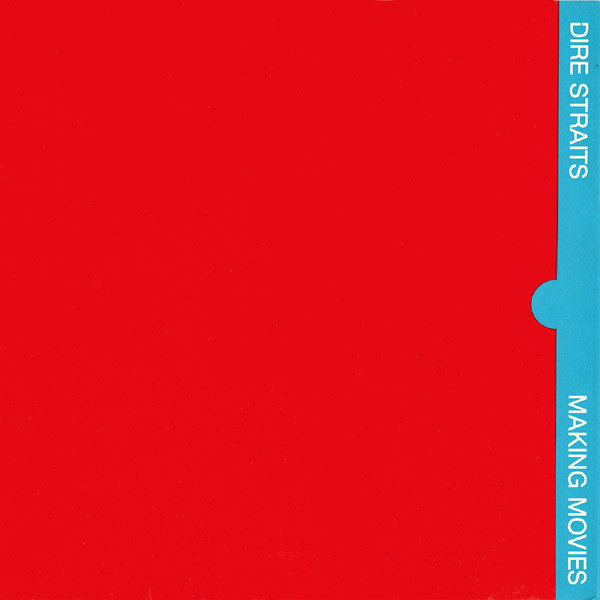
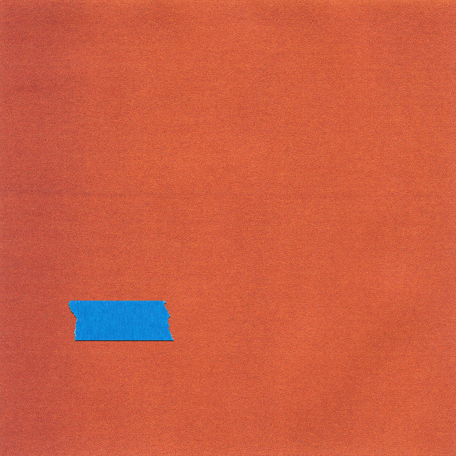
Find more solid color album covers below:


The Art of Cover Art is a free educational and inspirational resource. If you have $5/ month to spare, it would be super helpful in furthering my research. Or, if you think a friend might enjoy this newsletter, the best way to pay it forward is by sharing!
A dozen comments, yet no mention of Spinal Tap!? ;-)
Great post! Of course, we can't forget The Beatles, whose cover of the "White Album" (designed by Richard Hamilton) was a reaction to the overstuffed, hyper-colorful Peter Blake design they employed on Sgt. Pepper's Lonely Heart's Club Band. Granted, the White Album design was most effective as first produced, with "The Beatles" embossed rather than printed in light gray as it was on later pressings.