In February 2021, a trend on TikTok known as the album cover challenge began making waves on the app. Users caption “Proof that anything can be an album cover" over personal videos. Within the twenty-second clips, they pick a frame, add a filter, followed by a parental advisory sticker, and voila, an album cover appears. To the trained eye, the majority of the covers are lackluster, but every once in a while, the outcome isn’t half bad. But what does it look like when a cellphone photo is used as cover art in the real world?
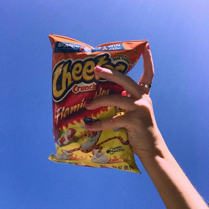
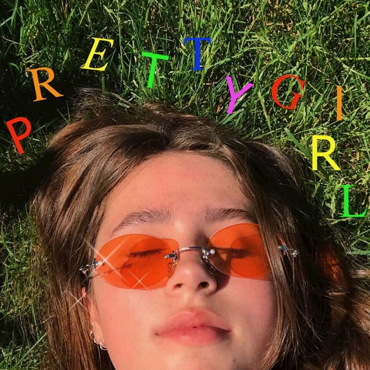
In 2017, before the viral trend came to be, indie musician Clairo used, what looks to be, a casual iPhone photo of a hand holding a bag of Cheetos against the sky for her single “Flaming Hot Cheetos.” Her fourth single, “Pretty Girl,” also looks to have a photo taken on a cellphone of the singer lying in the grass. A slew of non-descript rainbow type has been laid on top of the photo alongside a few faux light flares. At the start of her career, Clairo, or Claire Cottrill, was a self-recording artist, creating music in her bedroom and uploading videos of covers to YouTube. The mentality was no frills, DIY, and the iPhone cover art fits right in.
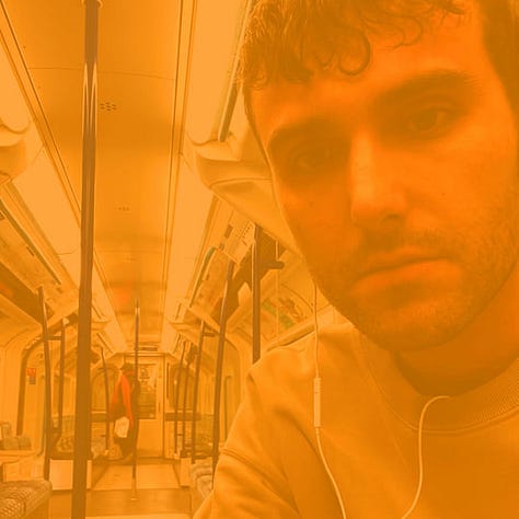
Fred again.., an alias of British producer and DJ Fred Gibson, is well known for using iPhone photos in his art. His music is said to be diaristic, hence the repetitive album name of his last three records, Actual Life, with dates denoting the period the music was recorded. This scrapbook aesthetic continues with the album art, seeing three selfies of Fred in a set of primary colors. If you scroll through his discography on any streaming service, you’ll see loads more selfies of Fred and collaborators as the cover art for his latest singles. Alone, the covers are banal and even a bit unattractive with the color overlay, but altogether, it feels like we’re flipping through a personal camera roll. In an article for The Music Network, writer Harry Hayes comments on the success of the authentic campaign visuals.
The cover art and Canvas videos (looping vids on Spotify) for his releases aren’t eccentric 3D artworks, but selfies directly from his phone, with a recurring colour filter over the top. This cuts through, amongst a sea of same-same artwork. It feels genuine and straight from Fred’s phone. It feels intimate and sparks curiosity. “Where is he?” “Did he just upload this now?” “Did he just write a song on a train?”. Selfies are what regular people do, everyday. Fred is ‘one of us’.


Amongst other major artists experimenting with cellphone photography is singer-songwriter Lizzie Grant, famously known as Lana Del Rey. For the single art for her 2021 track “Blue Banisters,” Del Rey chose a selfie of herself in a softly lit environment, but with a design that harkens back to the now cringe, MySpace, and Flickr aesthetics. Adorned with a curly cue font, “hand-drawn” corners to frame her face, and a random white rectangular border on the left and bottom sides, the cover feels as though it were carelessly designed in a joking way. In comparison to her previous iconic album covers set in vintage eras, the “Blue Banisters” cover may be the top contender for reasons not to use an iPhone photo as your cover art.
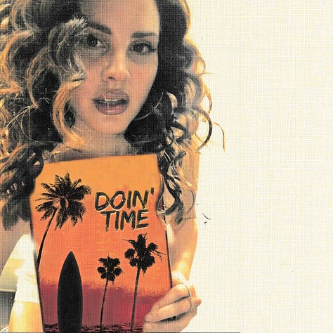
But this wasn’t the first time the singer released a “DIY” cover. The single art for her hit “Doin’ Time” off the 2019 record Norman Fucking Rockwell! shows a photo of the singer holding a small painting of an island setting, taken on what looks like the Mac photo booth app. Most recently, she also used what appears to be an iPhone or maybe even a computer photo (it’s giving Zoom screenshot) of herself praying, hands to forehead, for her 2023 single “Say Yes to Heaven.” Thankfully Del Rey chose to leave off the early 2000s Flickr design details this time around, but the art still doesn’t land the same way as Fred's or Clairo’s does.
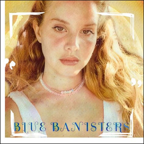
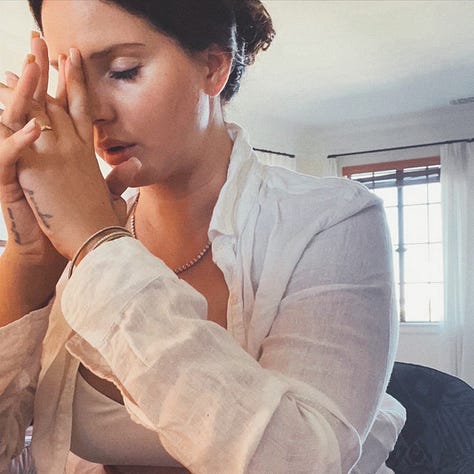
Perhaps the iPhone single art would work better if Lana had totally rid herself of her famous vintage look, but the albums to which all of these singles belong don covers shot on film, adhering to the classic aesthetic the singer is known for. While Del Rey is famous for her “fuck it” attitude, these one-off covers just seem more lazy than rebellious.
A rising indie band known for their nonconformist, mysterious ways is London’s bar italia. Pitchfork writes, the lo-fi trio “spent their first few years in quasi-anonymity, tinged with the default intrigue that attaches to certain bands who decline to overshare.” Amidst their purposeful ambiguity, their visuals pair equally as vague. The album art for their latest release, Tracey Denim, is the first time the band fully appears on a cover of theirs. The original image, also used as their press image, is none other than an iPhone photo of the group sitting outside a cafe. The photo has been edited, the threshold effect turned all the way up in Photoshop, creating a contrasted black-and-white image. Instead of the authentic, accessible feeling that fans may get from Fred again…’s art, bar italia’s record cover treats the iPhone pic as an impenetrable form of imagery.
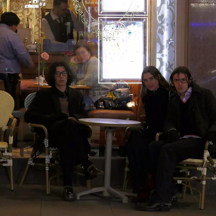
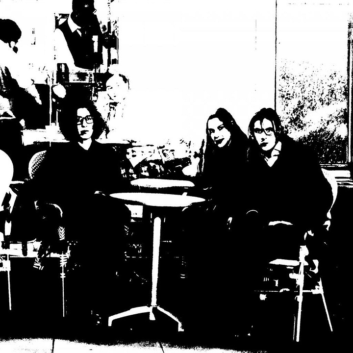
Find more cellphone imagery as album art below and on Album Whale:
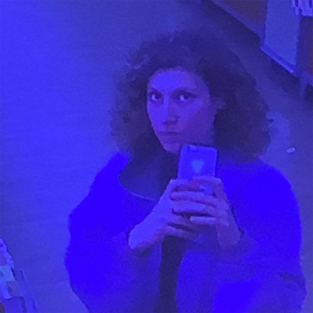
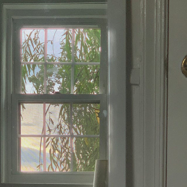
The Art of Cover Art is a free educational and inspirational resource. If you have $5/ month to spare, it would be very helpful in furthering my research. Or, if you think a friend might enjoy this newsletter, the best way to pay it forward is by sharing!


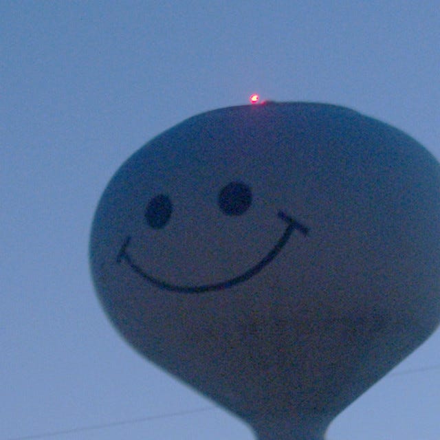

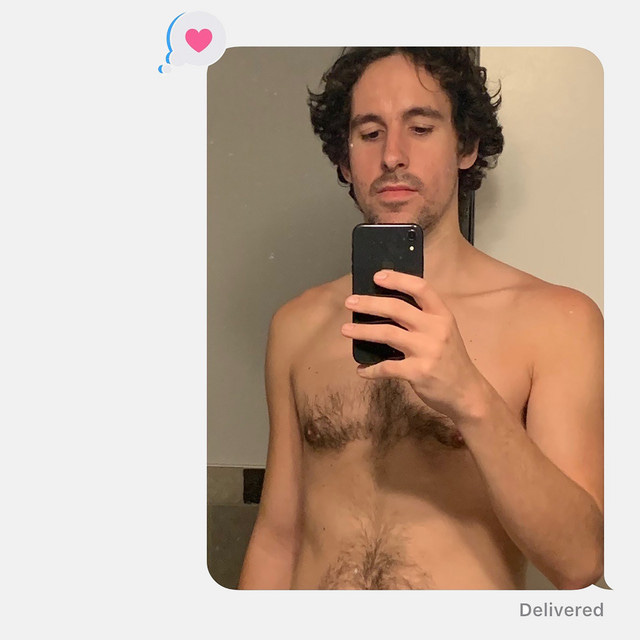
Amazing read as always ✨ Definitely worth checking out @loose__c who I believe is the creative director behind Fred Again..'s visual world!
Although not an album cover, Lana Del Rey used self-shot webcam footage in the video for Video Games. I remember critics at the time drawing comparison between the fuzzy, low-res nature of a webcam and the warm, blurry vintage that makes up the rest of the video. While I don't disagree with any of your points made above I think her recent selfies should be seen in context within her entire career.