Record Covers that Defy the 12" Square
Challenging the standard LP jacket through die-cuts and geometric possibilities
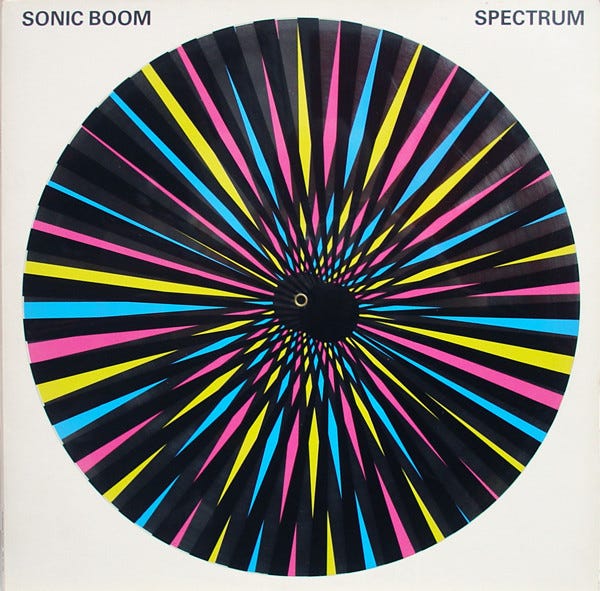
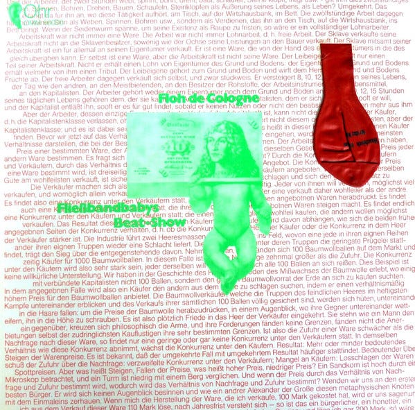
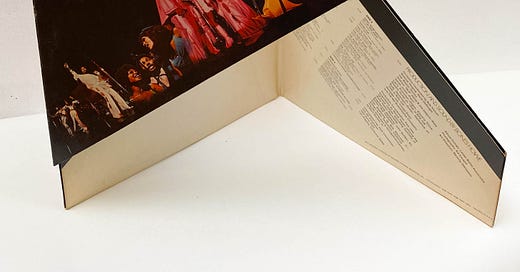
From the 7” to the 12”, the record cover has lived within the parameters of a square since its inception. But along the way, some designers have defied its 2-dimensional limitations by utilizing die-cuts and the possible jigsaw combinations of a square canvas, to create interactive jackets for fans. Designer Craig Braun brought Alice Cooper’s School’s Out into the classroom by transforming the jacket into a wooden desk and creating a packaging just as eccentric as Cooper. Opening the jacket like you would a desk, we find a messy assortment of supplies, memorabilia, and the record scantily dressed in a pair of panties (later banned from the UK edition). Braun even adorned the bottom of the jacket with legs to make the desk stand. In 1978 Cooper brought back the “pop-out” functionality for the packaging of From The Inside as well.
Just as he transformed modern art, Andy Warhol also altered the interactiveness of record covers with his banana peel sticker for The Velvet Underground and the risque zipper on The Rolling Stones’ Sticky Fingers. Designer Peter Corriston trademarked the die-cut on Led Zeppelin’s Physical Grafitti and The Rolling Stones’ Some Girls, creating easter eggs in the form of windows and silhouettes for fans to unearth.
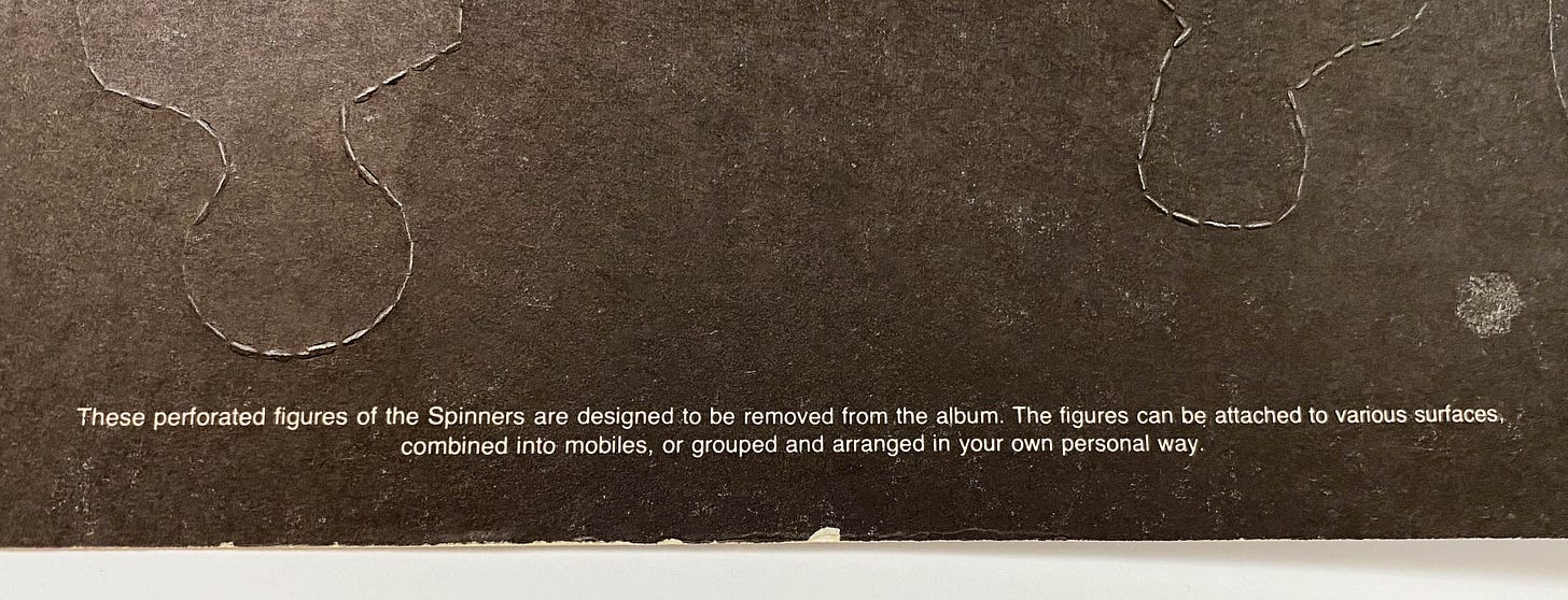
In 2010, MGMT included a coin in their packaging on Congratulations, inviting fans to literally scratch off the cover to find a hidden alternative underneath. In 2013, The National followed the reflective lines on their cover of Trouble Will Find Me to create a special edition die-cut puzzle-Esque visual. Nowadays, with vinyl making a resurgence, we’re still more likely to see artists selling limited-edition colored vinyl, booklets, or deluxe box sets instead of rebellious shaped jackets. But I’d be happy to see mainstream artists who can afford to, bring back this lost art. Take the Spinners’ Pick Of The Litter for example. I could easily see groups like BTS, The Spice Girls, NSYNC, The Jonas Brothers, or One Direction adopting this perforated pop-out design.

Find more innovative packaging throughout the years below:


The Art of Cover Art is a free educational and inspirational resource. But, if you have $5/ month to spare it would be super helpful in furthering my research. Or if you think a friend might enjoy this newsletter, the best way to pay it forward is by sharing!


