Psychedelic Nouveau
How a 19th Century Art Movement Visually Inspired the 1967 Musical Revolution
In 1967, The United States of America was undergoing a series of radical changes. From Martin Luther King Jr. paving a pathway for racial justice, to young Americans protesting the Vietnam war, the musical psychedelic “revolution” was born out of a desire to see love, peace, and equality in the world. The movement began in San Francisco, specifically the Haight-Ashbury neighborhood which was home to bands like Grateful Dead and The Jefferson Airplane, and the birthplace of Rolling Stone magazine.
Almost a century earlier in Europe, an artistic revolution named Art Nouveau (in France), or Jugendstil (in Germany), was breaking away from the traditional techniques of the Victorian era. Literally translated as “new art”, the movement occurred at the bridge of the 20th century, beginning in the 1890s. Inspired by the linework of early Japanese prints, artists sought out organic shapes and lines; pictorially finding them in nature and the human body; typographically utilizing curved text with exaggerated serifs, and decoratively in multi-color and multi-textural curved surfaces. Famous artists of the movement include painter Henri de Toulouse-Lautrec, illustrator Aubrey Beardsley, graphic-designer Alphonse Mucha, and architect Antoni Gaudí.
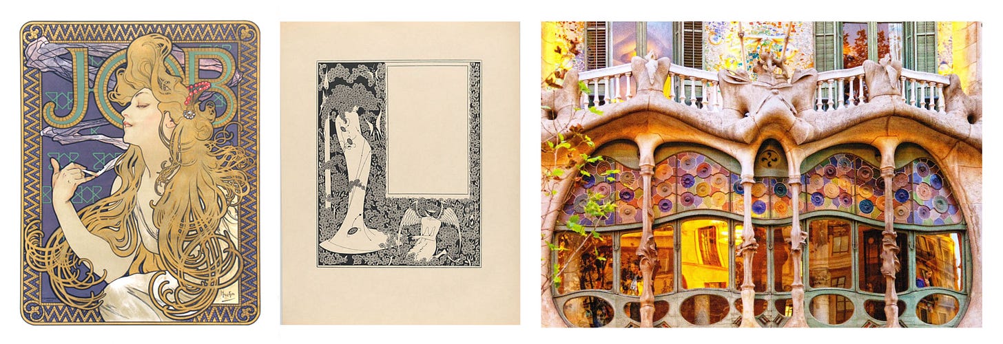
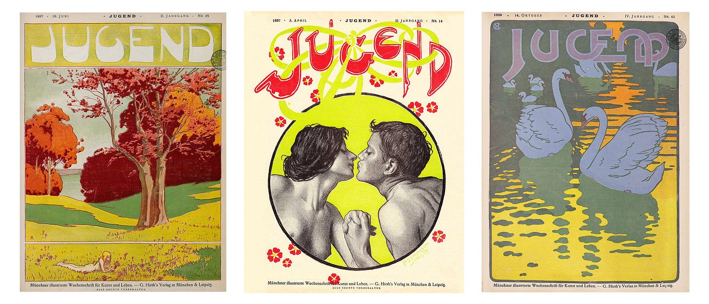
In the latest newsletter of Casual Archivist (which I highly suggest subscribing to), designer Elizabeth Goodspeed explores the artful covers of 19th century Munich publication Jugend, founded in 1896. As you can see below, the magazine embraced Art Nouveau, leaning into the saturated colors, flowing linework, exaggerated typography, and natural imagery of the movement.
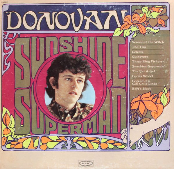
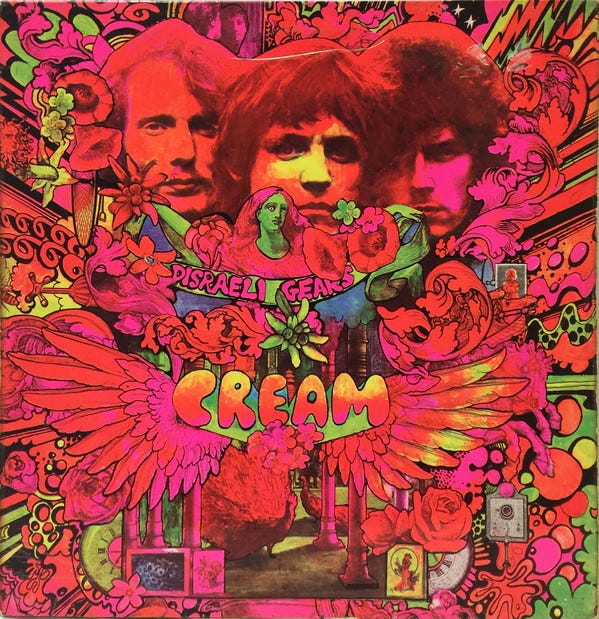
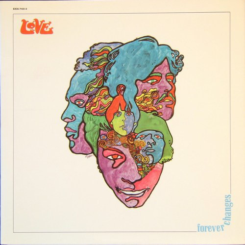
At first glance, the covers look too modern and forward-thinking for their time. Our confusion is due to the artists of San Francisco adopting Art Nouveau as the visual style of psychedelic rock. What we associate as an original style, is in fact an inherited one. On posters and album covers, you’ll see the same typography, and imagery utilized, just with the dial “turned up to eleven”.
In the September 1st, 1967 issue of Life magazine, writer Jon Borgzinner interviewed the San Francisco artists who popularized the latest cultural aesthetic:
“Wildest of the current poster makers is the San Francisco school. Wes Wilson, 29, designs posters whose wiggly typography melds into stylized images of girls akin to pre-Raphaelite vamps. He couldn’t be more arcane. His lettering has been described ‘36-point illegible.’ But Wilson’s colors are psychedelicacies of almost fluorescent oranges and lavender rather than the sickly yellow turn-of-the-century chromatics. ‘It’s gotta be fast,’ he says. ‘The best poster is the most dynamic.
At first, psychedelic poster art appears to look like logs of LSD trips, but it is also derived playfully from past and banal images. Rick Griffin, 24, calls the romantic book illustrations of Gustav Doré a major influence. He rebelled against his art school teachers in Los Angeles when they said symmetry was static. His favorite type faces are P.T. Barnum, Playbill and Bank Note.”
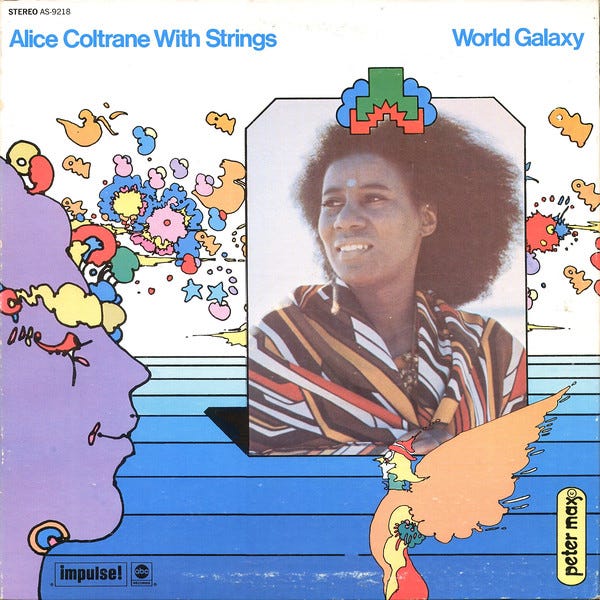
As named above, the cover story highlights artists Wes Wilson and Rick Griffin alongside fellow San Francisco artist Victor Moscoso and New York-based artist Peter Max. Each of the artists’ works harkens back to art nouveau or the “past and banal images” Borgzinner casually describes. It’s their choice of complementary colors and “wiggly typography” that makes their art “look like logs of LSD trips”, separating the psychedelic movement from its forefather.
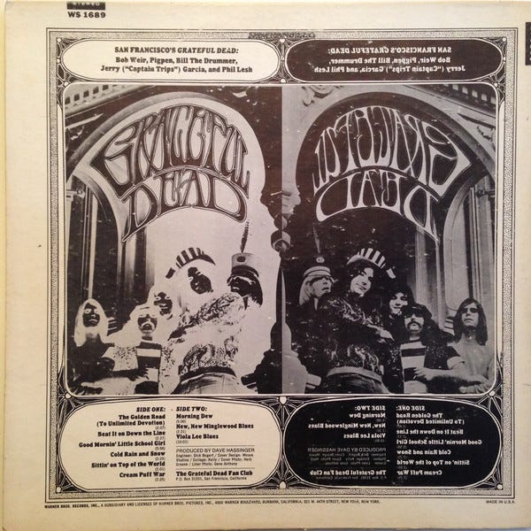
While these artists cemented the visual style of the psychedelic era through the medium of posters, the aesthetic also bled into the album covers of the era. Below you’ll find the same curved typography, bold linework, and iconography integrated into the 12x12 vinyl format.
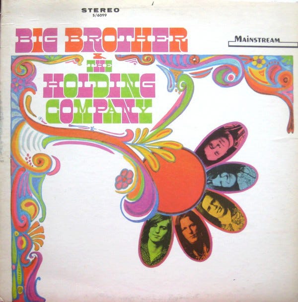
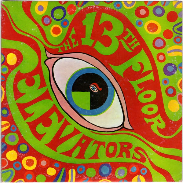
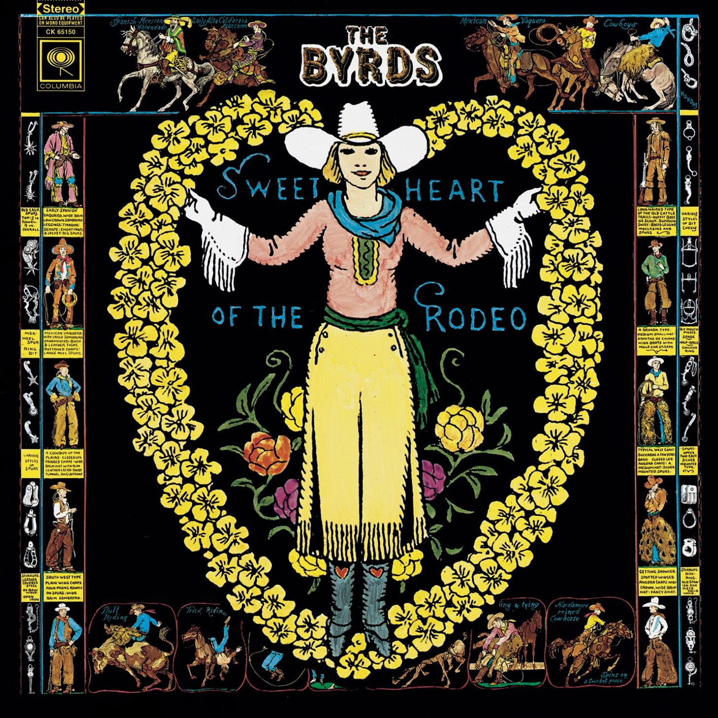
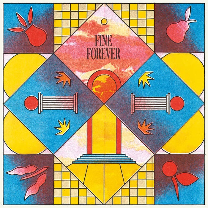
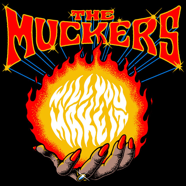
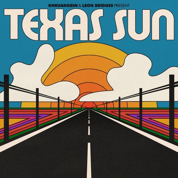
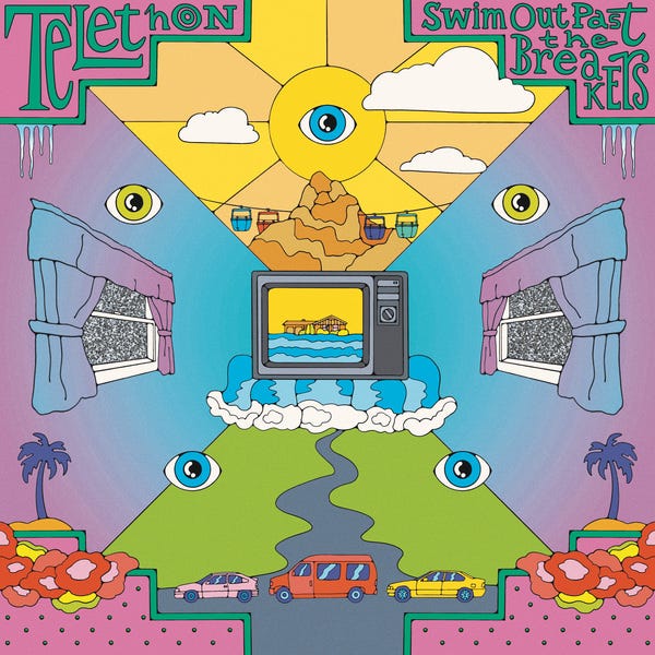
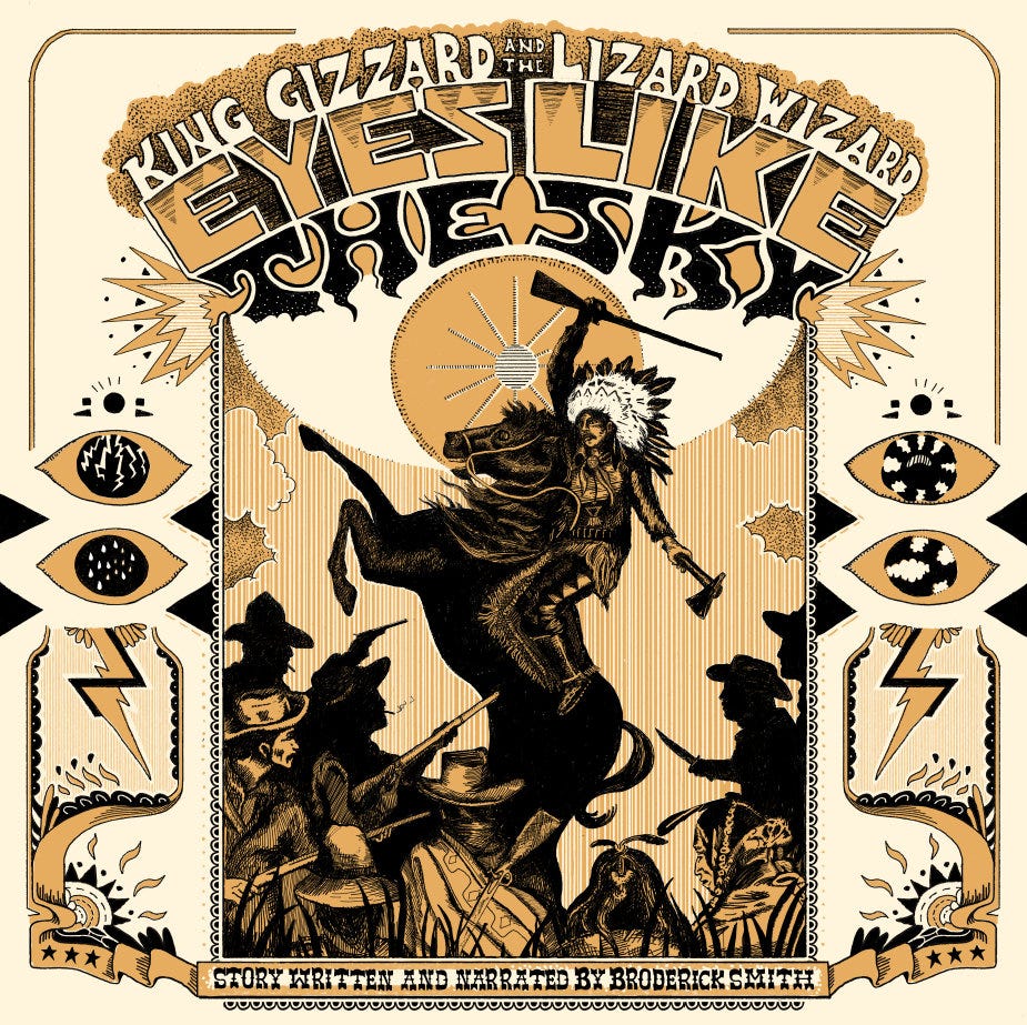
With psychedelic rock still popular in the 21st century, the style, musically and aesthetically, has continued to grow and adapt in the modern age of streaming. While the characteristics of Art Nouveau may no longer be at the forefront, the remnants of its typography and linework can still be seen, but now emblazoned with the LSD color combinations of its 1967 iteration.
I’m looking for The Art of Cover Art to be a free educational and inspirational source since there is little documentation on the art history of album art. But, if you have $5/ month to spare, it would be super helpful in furthering my research. Or if you think a friend might enjoy this newsletter, the best way to pay it forward is by sharing!


