Maximalist Text-Based Art, In the Age of Streaming?!
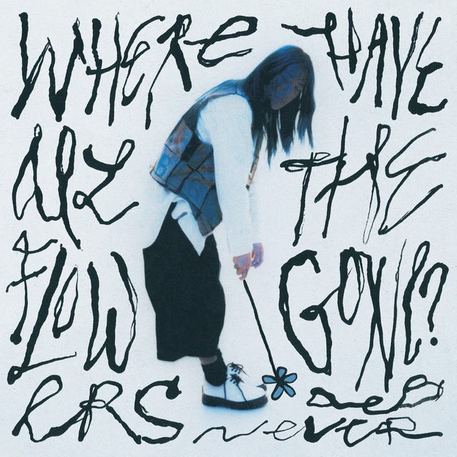
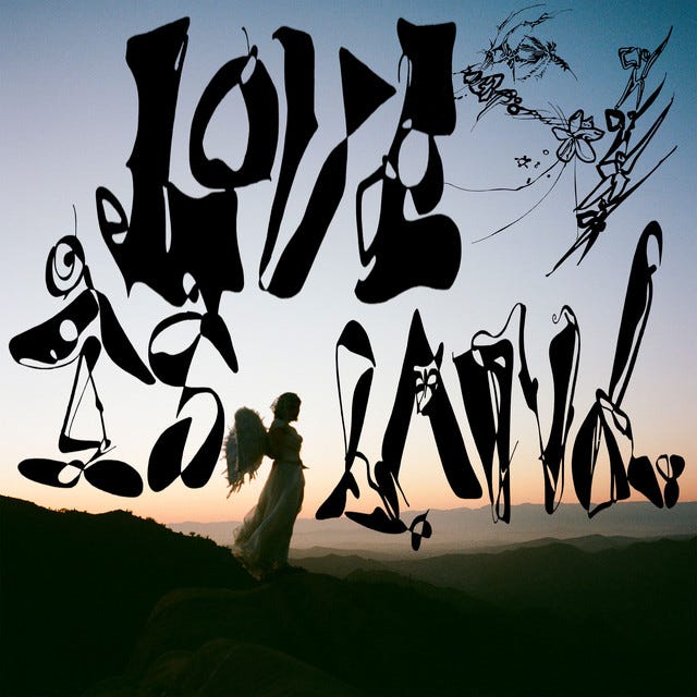
Typography say f*** it and takes front and center on these covers
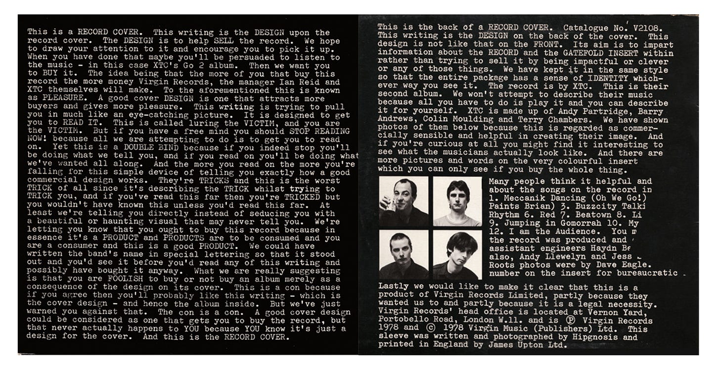
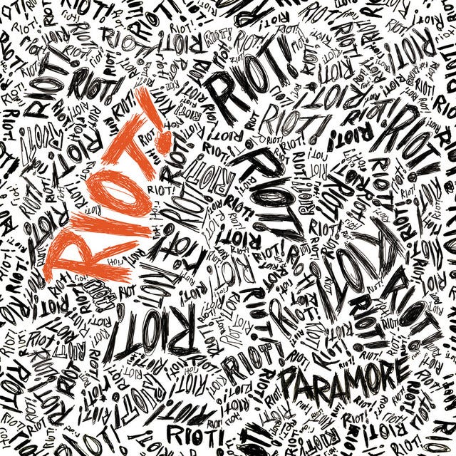
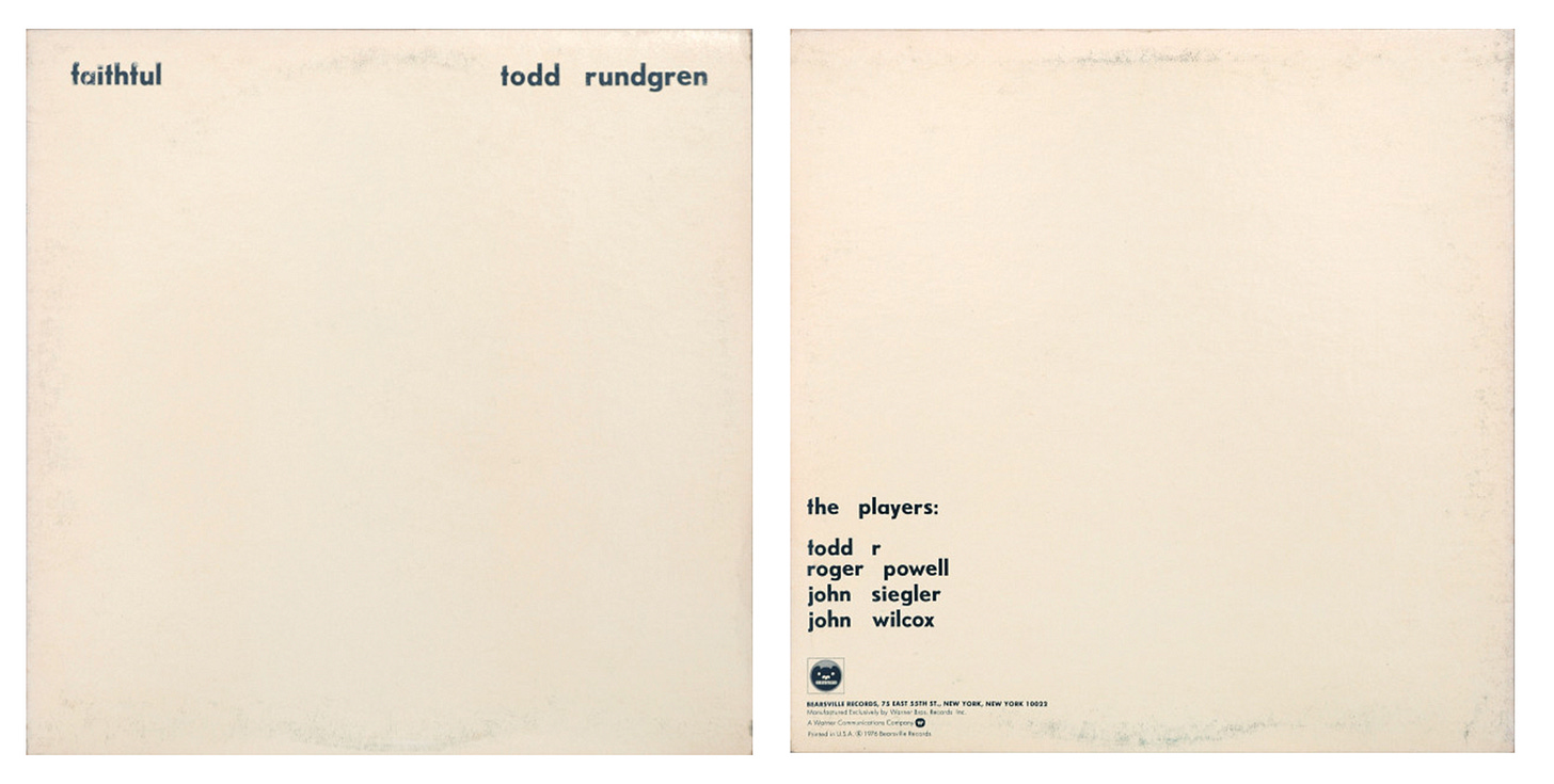
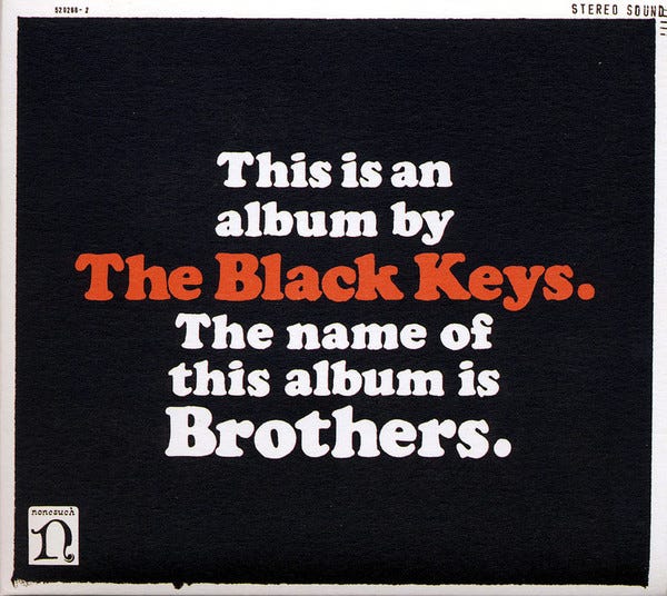
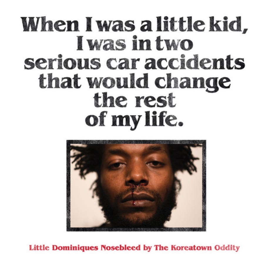
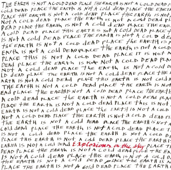
Text-based art can be straight and to the point, or abstract and poetic. From Barbara Kruger to Jenny Holzer, Ed Ruscha, Christopher Wool, and Sean Landers, the list goes on and continues into album art. Copy has always been an integral part of a record, accompanying the artwork at hand, displaying the name of the artist on the cover to lyrics and credits filling the inner contents on the gatefold and inserts. Vice versa, sometimes strong typography is all it takes to make a great album cover, as seen below.

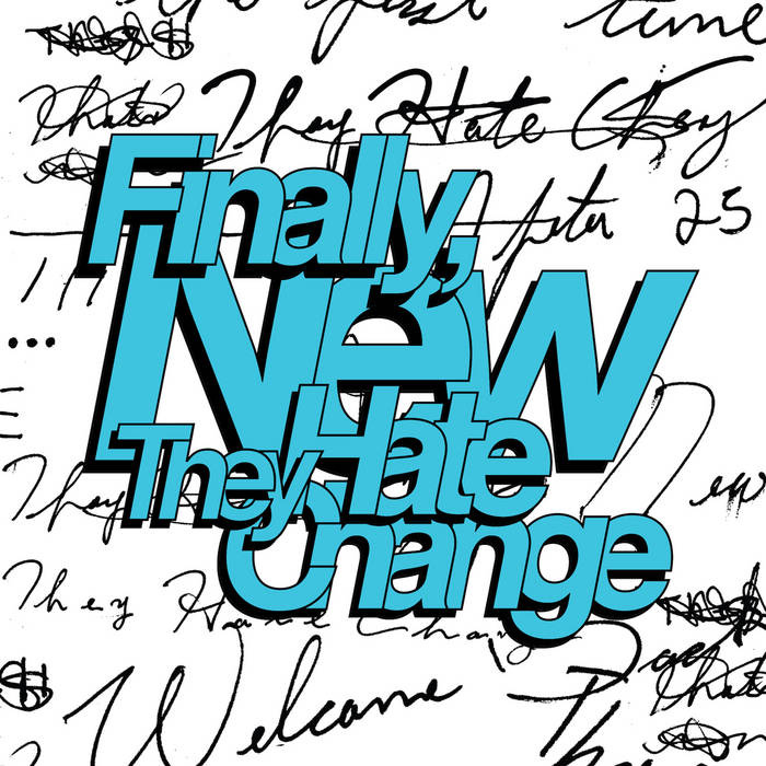
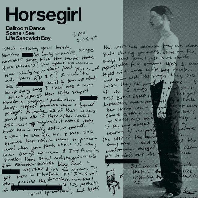
The trajectory of typography in the age of streaming has taken the shape of a learning curve, falling off covers due to their small illegible size on mobile and the artist’s name incorporated into the UX design. But some artists are rebelling and leaning all the way left, experimenting with text in a maximalist way. See They Hate Change’s album campaign for Finally, New and Horsegirl’s “Ballroom Dance Scene / Sea Life Sandwich Boy”. Zoomed in, these covers challenge fans to find easter eggs within the maze of text, while from afar, at a penny size, the text creates engaging amorphous shapes, shouting to be read.
Explore graphic text-based album art, both minimalist and maximalist, throughout the ages below.


The Art of Cover Art is a free, educational, and inspirational resource. If you have $5/ month to spare it would be really helpful in furthering my research. Or, if you think a friend might enjoy this newsletter, the best way to pay it forward is by sharing!


