Interview: Ben Tousley on Designing for Fleet Foxes and Rostam
The artist takes us through his creative process and current inspirations
I first came across Ben Tousley, the person, through a friend’s Instagram DM. While I wasn’t familiar with the name, I quickly realized, while scrolling through his profile, that I was very familiar with his art. From the Grizzly Bear album covers that catapulted him into the world of music to podcast art for The New York Times and title design for HBO Max’s Gossip Girl reboot, your life has also most likely been impacted by Ben’s work.
When not designing physical packaging for artists like Steve Reich, Fleet Foxes, and Rostam, he also runs Buds Digest, “a culture magazine for queer stoners.” Below, Ben takes us through his creative process and recommends other talented visual artists in the community to keep tabs on. Break out a pencil and paper- you’re going to want to take notes!
What is your earliest memory of design or earliest music memory?
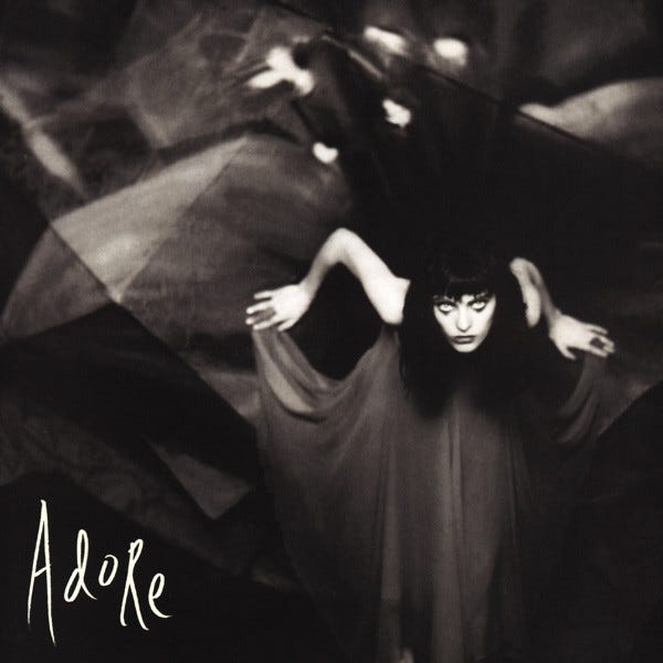
In terms of design, I recall a tape cassette of Alanis Morissette’s Jagged Little Pill as one of the first albums my parents let me get, probably around age eleven or twelve. In my memory, I loved the way the insert folded into the case and studying the fine details from the color halftones in the design. I also remember that the mass-production plastic smell was kind of sweet. She ended up being my first concert on the next album cycle. A couple of years later, Smashing Pumpkins “Adore” really locked me into this fascination for life.

As for the earliest music memory itself, my grandmother had a large piano and also a keychain with a music box on it that I would spend a lot of time with. Both forms of acoustic sound making but at very different sizes; both I’m sure I drove my family crazy with. I found that music box recently and it’s such a simple but mystifying charm.
What are you listening to right now?
ML Buch’s Suntub was my favorite album of 2023, and it will probably be my favorite album this year, as well. I recently had a dive into Clarissa Connelly’s work and was spellbound for a solid block of time trying to receive it. I can’t wait to hear the rest of her new album, as well as the new Amen Dunes and Jessica Pratt albums.
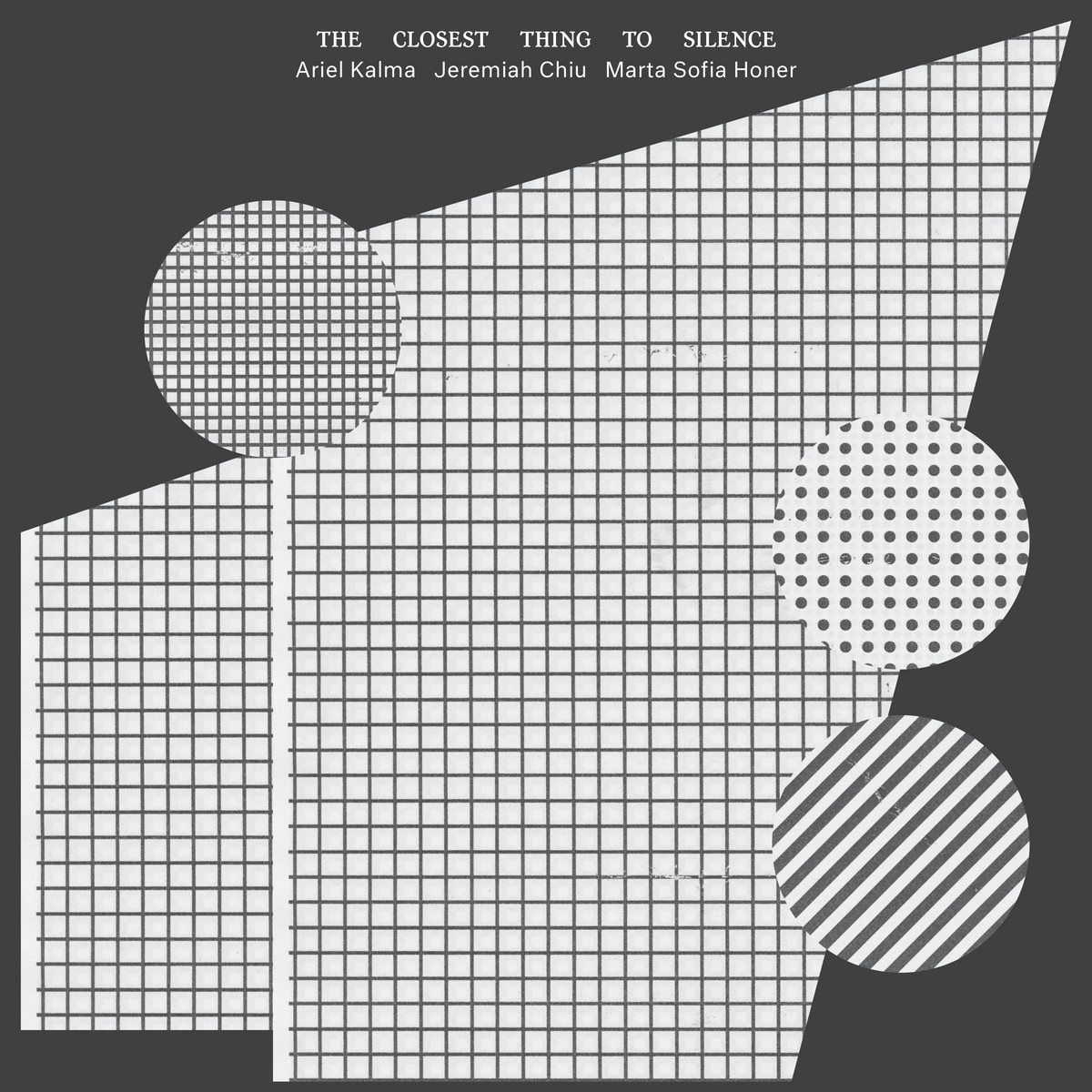
I’ve also been loving the recent collaborative releases from Jeremiah Chiu (who is also a fantastic designer responsible for those beautiful sleeves). I’ll take anything from him, Meg Duffy, Caterina Barbieri, Bullion, and Spencer Zahn. Riley Mulherkar and Andy Clausen, members of the brass group The Westerlies, also have gorgeous new releases this year that both have been on rotation a lot. Brass forever!

Can you describe your creative process when creating an album cover or a visual for music?
Ideally, I can hear the music upfront and keep it playing through the process. It’s truthfully the best part of the job. I’m very grateful for the experience of hearing new or in-process music at that stage where anything is possible.
Aside from that, it can differ from artist to artist. My main objective is to help translate their vision, but that can take different forms. Sometimes, an artist may have an idea or even a specific image already in mind. Sometimes, they need help channeling lyrical or conceptual thoughts into visual ideas. Starting with a dialogue is key to assessing what feels worth exploring. It can be helpful to pull a mood board of potential references to give us something to react to and discuss.
We’ll then identify whether there is existing imagery to work with or if we need to commission or make something. The latter can be a fun process but certainly difficult to map. I love to collaborate with artists on projects like this and have a pretty hands-off approach to art directing—if I get to the point of commissioning something, it’s typically because I admire their work. It is a great joy to see how other minds can react to a prompt.
Not to pick favorites, but is there a specific record you've designed that holds significance in your work? Perhaps symbolizing a turning point in your creativity?
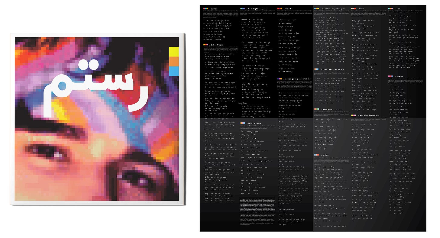
There was a string of records around 2017-18 (Fleet Foxes Crack-Up, Grizzly Bear Painted Ruins, David Byrne American Utopia, Rostam Half-Light, Steve Reich Pulse/Quartet) that, looking back, feels like a significantly productive period for me—this music design path had been going for a while, I was reckoning with my aesthetic limitations and leaning into the joys of collaboration. I’m not sure how fulfilled I felt, though.

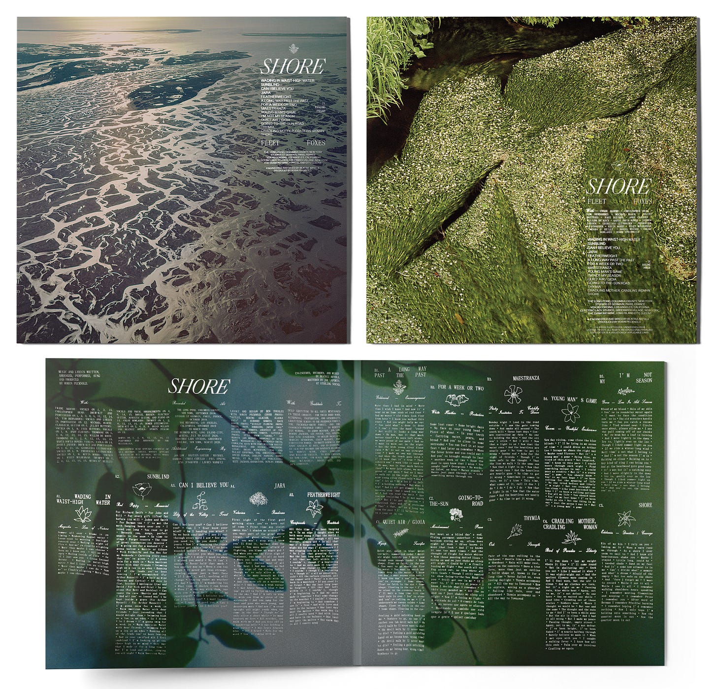
That ended up blossoming further around 2020 when, of course, under seismic global events, we all underwent another collective reckoning with the pandemic. I was blessed again to work closely with Robin Pecknold (Fleet Foxes) and Cecile McLorin Salvant to develop record sleeves that were driven by their artistic visions with a lot of hands-on back and forth. I think the urgency with which we worked on Shore and Ghost Song and both Robin and Cecil’s creative drives during that otherwise stressful time felt really powerful and still reverberates for me. It can be healing to throw yourself into your creations and share them with others, obstacles be damned, and I feel like they showed me that lesson in real time.

I can look at both of those periods now as times when I inched further towards being more comfortable with what I could offer, relinquished control to get the best results, and followed where experimentation and outside input would lead. And ultimately I’ve found those to be ways to nurture my own creative voice. I crave more of those experiences now and have been manifesting creative challenges to keep that exercise up.
What are some of your favorite design or art moments throughout music history or recently?
I was a sponge in the year 2000, and my love for the Radiohead Kid A/Amnesiac era of output endures. The sheer amount of visual output, the unique voice, and the way they subverted advertising requirements and expectations remain inspirations, and I wish more artists built worlds at that scale for their fans.
Other classics for me include M/M Paris with Bjork forever, Julian House’s work with Broadcast (very excited for their new demo collections), Non-Format, Hipgnosis, Vaughn Oliver and Peter Saville of course. The Echo & the Bunnymen covers, Robert Wyatt, Hood, The Clientele, Scott Walker, Kate Bush, John Martyn, and Phil Elverum’s worlds of Microphones/Mount Eerie all remain influential pillars for me.
Recently, I have loved seeing new work from Jason Evans, Josh Padarathsingh, Vasilis Marmatakis, Martin Falck, Sean Walcott, Rob Charmichael, Somnath Bhatt, Justin Hunt Sloane, John Provencher, Alfie Dwyer, Gustavo Eandi, James Ronkko and Travis Brothers — woah.

What are your thoughts on cover art in today's digital-heavy music industry?
What a time to be a creative person. More and more, we see young visual artists taking off through social media, and it’s thrilling. Widespread access to tools and the visual nature of our online spaces has been rocket fuel for exploration. The digital nature of the marketplace has fostered that and encouraged more people to do what they want and seek out what they think feels fresh without marketing departments intervening or deeming what is consumable. That is a gorgeous thing, and it’s exponential at this point. I can’t wait to see what the landscape looks like in another ten or twenty years. Hopefully, we get that algorithm and social feed mess worked out.
Name any other designers/ studios making work in the music space that you admire.
Braulio Amado, Hassan Rahim, and Mario Hugo are all fountains of beauty and inspiration. Their voices flow through their work. I think I’ve taken a more chameleonic route to collaborating with people and so I admire artists like them who have been able to make careers out of following their muses with such integrity.
The Art of Cover Art is a free educational and inspirational resource. If you have $5/ month to spare, it would be very helpful in furthering my research. Or, if you think a friend might enjoy this newsletter, the best way to pay it forward is by sharing!


