


Interview: Artist Michael Ryan Brennan on Designing Album Art in the Modern Age
How the Creative Director of NOT 97 and Secretly Group designer combined his two passions of music and art

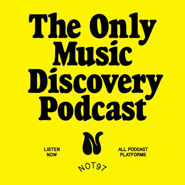
I first came across designer Michael Ryan Brennan through Wisconsin rock four-piece Slow Pulp. He designed the cover of their 2020 debut album Moveys, a graphic piece laden with intricate figures by painter Nancy Mladenoff. Originally from Cranbury, NJ, (a stone's throw away from where the great Bruce Springsteen grew up) Michael now resides in Brooklyn, NY where he works as Creative Director of music podcast NOT 97 and a designer at Secretly Group. Below we chat about being a chameleon, enhancing an artists’ work through design, and one of Bob Dylan’s (worst?) album covers.

What's the first thing you do when you wake up?
Michael: Check the surfcam and lay on the floor with my dog. After that, it’s a daily ritual I wake up early to accommodate: coffee, a book, and jazz radio. Either WBGO or WKCR.
List three albums that best describe yourself:
Michael: Darkness on the Edge of Town, Bruce Springsteen (was raised on him, and I’m also from NJ)
Magical Mystery Tour, The Beatles (the first music/tape I was ever given)
Tha Carter III, Lil Wayne (high school locker room nostalgia that really never left)
How did you begin designing cover art?
Michael: It was always something I was enamored with, but I never really thought it was realistic to do it professionally. Years ago, when some friends were starting a new music podcast (NOT 97), I was doing a grad program in design and constantly looking for creative outlets. I immediately said I’d do all the design.
I ended up pouring a lot of heart into that because it was so easy to. I was combining two passions: music and design. I met a lot of young, talented musicians and ended up doing some single art here and there. Eventually, the idea of being able to sustain myself as a designer working only in the music industry started to feel like less of a pipe dream. I’d worked some jobs over the years that weren’t super fulfilling, so I knew how meaningful it could be if I made that happen and it became a singular focus. After a fair bit of freelance life, I got a job as a designer at Secretly Group (Dead Oceans, Jagjaguwar, Secretly Canadian). That’s where I started doing a lot more cover art and packaging for all physical formats. I’ve been there for over two years now.
How do you think your role as a designer has shaped your own musical interests?
Michael: It’s definitely broadened my listening. As I’m sure a lot of us do, I end up checking out new stuff based purely on the art. Liking the art doesn’t necessarily mean I’ll like the music, but you have to try. This might be niche, but I actually end up discovering great stuff when I notice that an artist or designer I like, works with a band I haven’t heard of. It’s usually a pretty good indicator in the indie scene. It feels nice to be able to trust quality based on association in that way. Like, “oh, if she’s doing this group’s art, and I love her art, I should probably check out the music.”
When beginning a new project, where do you usually start?
Michael: I always listen to the music; even if the artist has a pretty good idea of what they want visually, it still feels like an important ritual for me. Artists will often come to the table with some sort of jumping-off point, like some photos they’re considering for the cover. It’s rare that I get a true blank slate. But typically I’ll start with some sort of mutual inspo sharing. Sometimes a mood board is the first move, but other times it’s more casual, like texting images back and forth.
How do you balance your personal design style while also keeping the musician's style in mind?
Michael: When an artist comes to you, they already have a ton of emotional associations with the work. You want to respect that inherent—and completely understandable—attachment they have to their art while showing them ways to present it visually to the world that actually enhance that connection to the work. Ultimately, there’s a certain satisfaction in facilitating another’s art and that’s the motivator for me.
It’s not always easy, but I do love constantly working in new styles. Working with a range of artists at any given time means I have to be a chameleon. When I’m asked to use a visual language that’s new to me, I see it as a moment to geek out. I end up dissecting and emulating whatever that style is and inevitably creating something entirely new because it was done with my hands and through my eyes. Whatever I learn then changes who I am as a designer. It’s constant stimulation, which I need. As a designer, I don’t think I could be content for too long with any one style. Plus, it’s often the blending of different styles that creates something unique and interesting. In a best-case scenario, when I’m interpreting the artist’s vision through my own lens and playing that back to them visually, they see their work in a new light and that creates something we can all be really excited about.
Any memorable projects? Can you walk us through the process?
Michael: Working with Porridge Radio on their album Every Bad earlier this year was a treat for me. That’s a great example of me really taking myself out of the process and helping the artist realize their vision. It was super satisfying because I love their music, and the artist was great to work with. She had a bunch of her own paintings she wanted to use; we were sifting through all these scans of paintings she had done on sheets of cardboard, just trying to figure out how to plate it all. Their background is super DIY, so the overall package had to have that vibe to it. We let the cardboard texture show through on the vinyl jacket, used her handwriting for the titles, and let the paintings shine.

Are you nostalgic for cover art of the past, designing full vinyl layouts? What are your thoughts on cover art and its role in our current music industry?
I definitely have certain eras I’m especially fond of. Classics that can’t be touched. But I think the industry does a good job of reviving, recycling, and reinventing things, whether it be the audio or the visuals. I trust that’ll continue. We’re also consuming more vinyl than ever before, and I’m confident there will always be a desire for that.
As for cover art itself, I think it’s become somewhat of a sacred thing and I’m reasonably optimistic that’ll hold. Though I definitely have mixed feelings about stuff like Apple’s animated album art. I don’t think it’ll take the place of static art, but I worry it might change the way people are creating. I hope designers don’t start making cover art a certain way just so it’ll look good once it’s animated. I believe there should be more space for motion graphics in the industry as we continue to spend more and more time on our screens; I just don’t want to lose the sacred stuff in the process.
Do you have any cover art designers you look to (current or past)?
Michael: I’ve always loved Braulio Amado. His work always inspires me to experiment and embrace weird outcomes. He stays fresh, too. I love how he breaks down his process and shows you that this wild graphic he made started just by scanning his kneaded eraser or something like that.
And I don’t care that it’s an overused answer, but Reid Miles. Everything he did with Blue Note… I can’t think of a more influential designer in music. There’s just so much there. From his use of typography to building an iconic house style for the label… It’s something people will probably always try to emulate.
Worst album cover you've ever laid your eyes on (let's be honest, there are a lot of wild ones out there!)
Michael: Such a tough one. Some of my favorites are just “bad” covers that have aged in a beautifully quirky way. But damn, Bob Dylan had a couple of rough ones in the 80s/90s. I’m going to go with Good As I Been To You, from ‘92. It looks like a church pamphlet designed on PowerPoint. And the decision to invert the color on the descender of the “y” - why?? Worst ever.

I’m looking for The Art of Cover Art to be a free educational and inspirational source since there is little documentation on the art history of album art. But, if you have $5/ month to spare, it would be super helpful in furthering my research. Or if you think a friend might enjoy this newsletter, the best way to pay it forward is by sharing!