The Art of Cover Art is and will continue to be a free resource for all readers. If you have the means this month, consider upgrading to a paid subscription to support my work. A small donation to my ongoing coffee fund is also always appreciated. Happy reading!
This week, our album art family grew to over 3000 subscribers, a remarkable, heartwarming number. It was just around this time last year that we were celebrating 2k. Coincidentally, the first album cover I shared in that post was Outkast’s Stankonia, and here I am, saluting our achievement with avant-garde hip-hop great André 3000 once again. I’ll admit, I couldn’t think of a better “3000” pun, but it feels appropriate because while André’s solo discography is minimal, his ability to break out of his rapper mold and adapt artistically resonates.
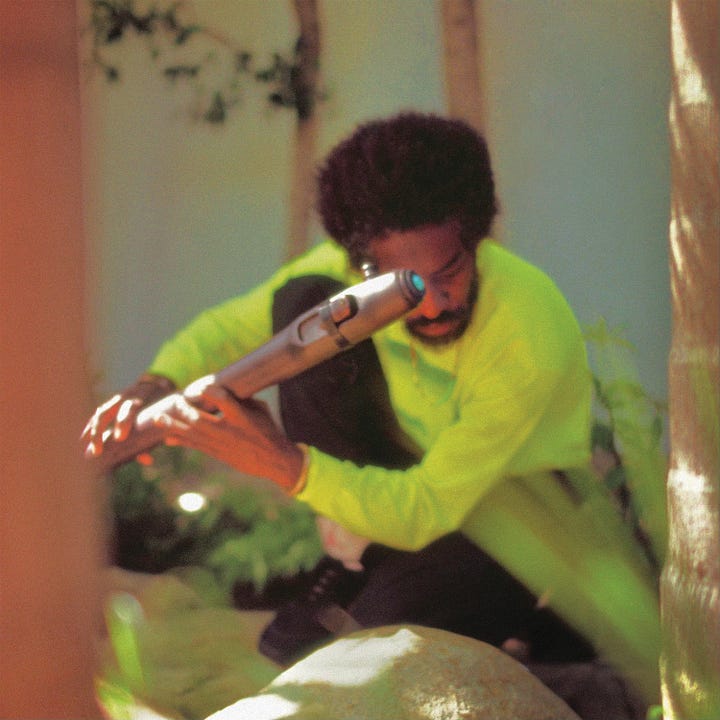

Writing has always silently weaved through my life, whether writing in my fifth-grade diary, writing the fashion column for my high school newspaper (unsure why I’m willingly admitting this), or running a DIY arts publication in my early 20s. Now, in the form of this newsletter, writing has allowed me to collate my practice and thoughts as a visual artist working in music. As Sadie Sartini Garner articulates in the Pitchfork review of André’s 2023 record, “Like every OutKast record, New Blue Sun is the product of a community.” Thank you for being part of the community that has produced The Art of Cover Art over the past few years. It has inserted a new level of curiosity into my everyday life.
Here are some behind-the-scenes moments while crate digging, researching, and making album covers, all while writing this newsletter:
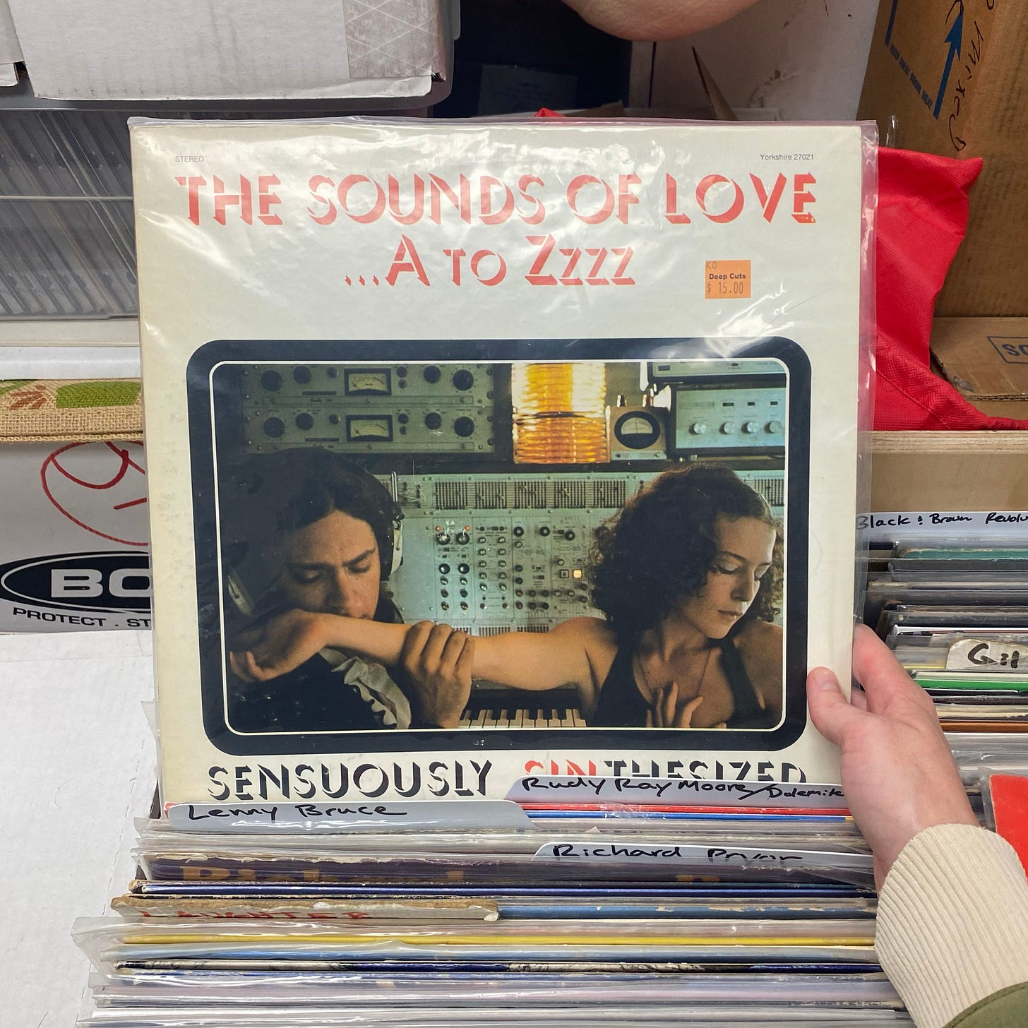
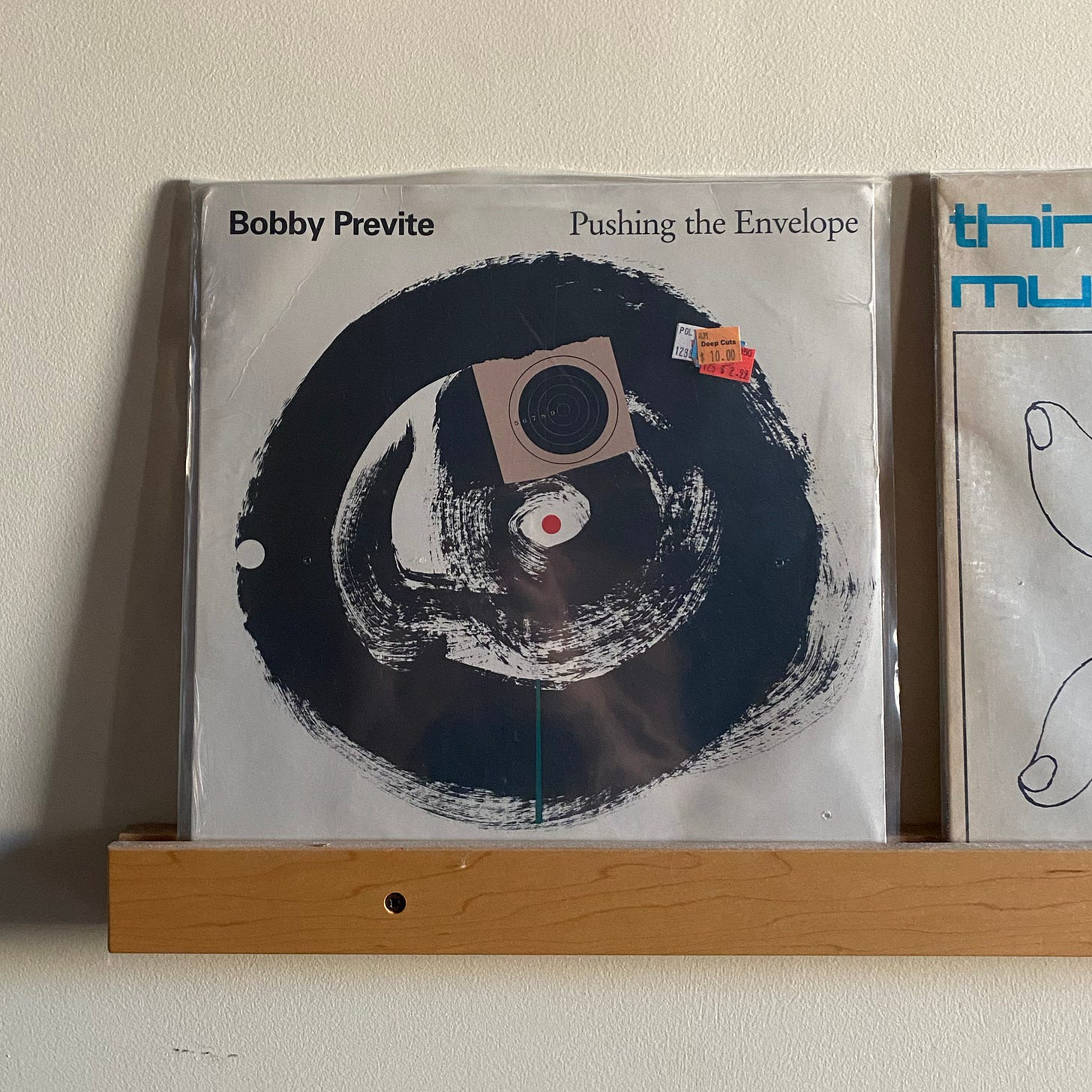
I found this gem while browsing the Adults Only section at my neighborhood record store, Deep Cuts in Ridgewood. While researching 1960s instructional medical records in August, I discovered a subset of instructional lust records, and this one fits right in. The campy photo… “sinthesized”… While I’m starting to wonder why I didn’t end up purchasing this LP, I did take home Bobby Previte’s 1987 record Pushing the Envelope. It sports an abstracted cover of a vinyl thanks to the brilliant mind of designer Ivan Chermayeff, who I wrote about at the top of the year. I always love finding records I’ve written about in the real world.
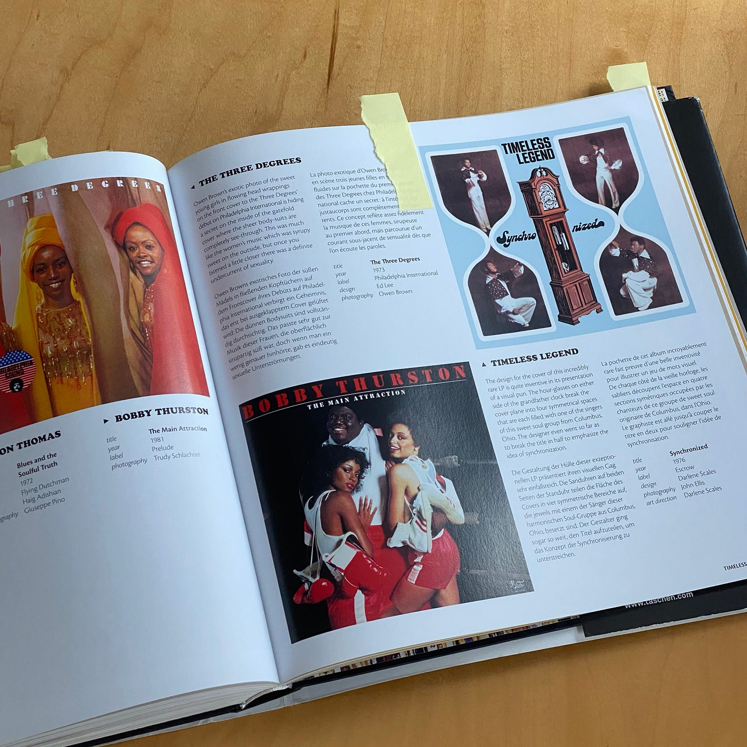
Looking at my bookshelf, you’ll see hundreds of ripped Post-it tabs decorating pages of notable interest. I borrowed this Taschen Funk & Soul Covers anthology from Resource Library, an art book lending community in New York. Some of my favorite covers from the volume include Timeless Legend’s 1976 Synchronized (shown below) and Whatnauts’ 1972 release, Whatnauts On The Rocks.
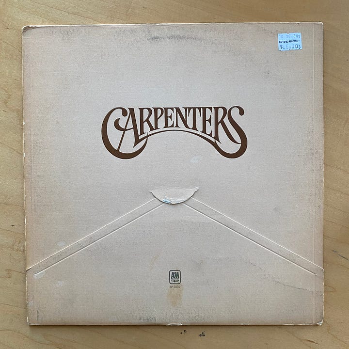
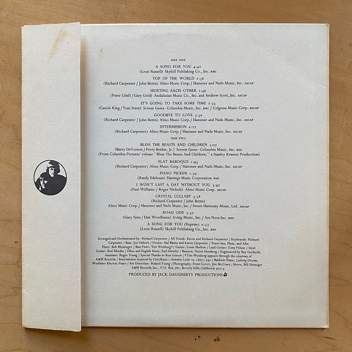
I came across these two Carpenters LPs (the 1971 eponymous album and A Song For You) at Captured Record Shop in Greenpoint. The logo caught my eye, but the unique packaging folds secured their place in my record collection. I love the idea of swapping out the classic open seam for simple, elegant envelope folds. Thank you, art director Roland Young, for these perfect details!
Whenever I travel, I always stop by a local record store to find releases from the area. (Keep your eyes peeled for when I visit Argentina in November!) This Edouard Castonguay record was stowed in the Québécois section at Death of Vinyl in Montréal, QC. I used it as a reference on a recent mood board for a press photo campaign I was shooting in a motel in New Jersey… haha!
Speaking of photoshoots, here are a few music-related projects I’ve been working on recently with my visual studio, POND Creative:
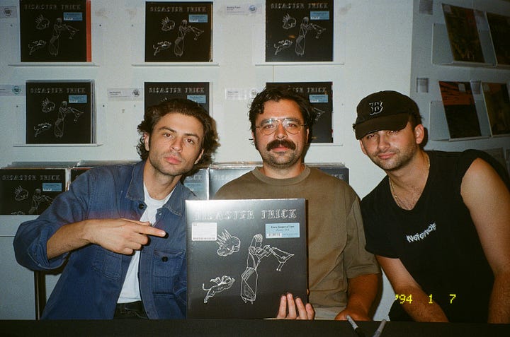
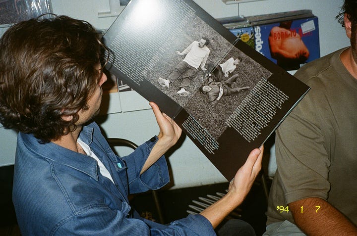
Creative direction, design, and photography for Horse Jumper of Love’s Disaster Trick. My favorite track off the record is “Lip Reader.” Dimitri and his partner Maria illustrated the front cover as a nod to outsider art. We took inspiration from the gothic font and created early printing press-esque blocks on the gatefold (my first). Here are the guys holding the record at their Rough Trade signing in August.
Over the summer, I designed and developed an early 2000s video game-esque website for Magdalena Bay’s Imaginal Disk alongside Mica & Matt. The duo created an entire lore around the album that was so meticulous and innovative. From the music videos to the live set, everything connects. Visit the site to find all of their easter eggs.
Around that same time, we also designed a website for Alvvays :) Inspired by their music video for “Very Online Guy.”
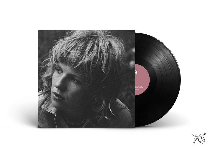
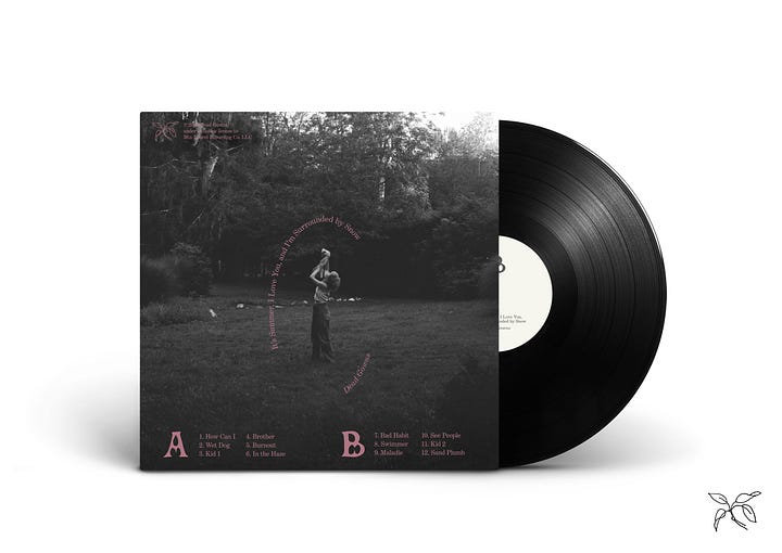
Announced this past week: Dead Gown’s forthcoming album It’s Summer, I Love You, and I’m Surrounded by Snow out on Mtn. Laurel Recording Co., February 14th, 2025. We photographed the cover and designed the physical packaging. Our mood board included a lot of iconic classic portraits of Jane Birkin, Sylvie & Françoise Hardy.
Last but not least, led the creative identity and branding for Brooklyn’s first solar-powered concert featuring Nation of Language, Grace Ives, Model/Actriz, and Psymon Spine. Here are some pics from the show on Stereogum!
Before you go, I drafted a survey to learn more about you and what you’d like to read in future newsletters. I’d love to hear from you if you have a moment to spare. Until then, I’ll continue rummaging through record store bins and diving further into this niche world of ours!
The Art of Cover Art is a free educational and inspirational resource. If you have $5/ month to spare, it would be super helpful in furthering my research. Or, if you think a friend might enjoy this newsletter, the best way to pay it forward is by sharing!




I cannot stress what a cool newsletter this is, and what a pleasure it is to see these images in my inbox. (And also how amused I am to see someone else using my "ripped Post-it tab" technique!) Can't wait for the Argentine album haul :')
Love your newsletter. And that Carpenters envelope is a beaut. just had my first photograph featured in album artwork (warmduscher’s too cold to hold) and it is my proudest moment as a photographer to date..as a kid i used to (and still do) stare at album covers for hours studying every single detail as if i would somehow miraculously see something i had missed on the first 100 plus views..can’t do that with a download ;)