


A Petition to Appreciate Shoegaze (At Least Visually)
Art has the Male Gaze, Music has Shoegaze

A wall of heavy fuzz backed by a trance-like rhythm, coated with a blanket of hazy bleeding vocals. This sound is no other than Shoegaze, a name disliked by the majority of the musicians who inhabit the genre but rooted in the downward glance they make changing pedals while performing. Also known as Dream Pop, the genre brings audience members and performers alike into a reflective, hypnotic state. According to Pete Kember, founding member of British psychedelic group Spacemen 3 (said to be the godfathers of Shoegaze), it all began in the Fall of 1988 when a small band named My Bloody Valentine played at the Roadmenders Centre in Northampton, England. As Kember remembers for Pitchfork,
The whole set was epic, faultless, but one song stood out in particular: a warped, staggering guitar voyage that seemed to encompass the quintessence of psychedelia. Pulsing waves. Building elliptical loops. A reverbed synchromesh of vocals, bass, drums, and guitar. Looming to unholy crescendos, then, devastatingly, snatching them away. Evaporating into a silken heat haze to rematerialize again out of the effervescence, stronger and more entrancing each time… That song was “You Made Me Realise.” And so a genre was born.
My Bloody Valentine (MBV) was formed in Dublin in 1983 with members Kevin Shields, Colm Ó Cíosóig, Bilinda Butcher, and Debbie Googe. But it wasn’t until they signed with Creation Records in 1988 and released their second album Loveless in 1991 that the group coined a musical genre, not just with their sound, but with visuals that also went on to define Shoegaze.
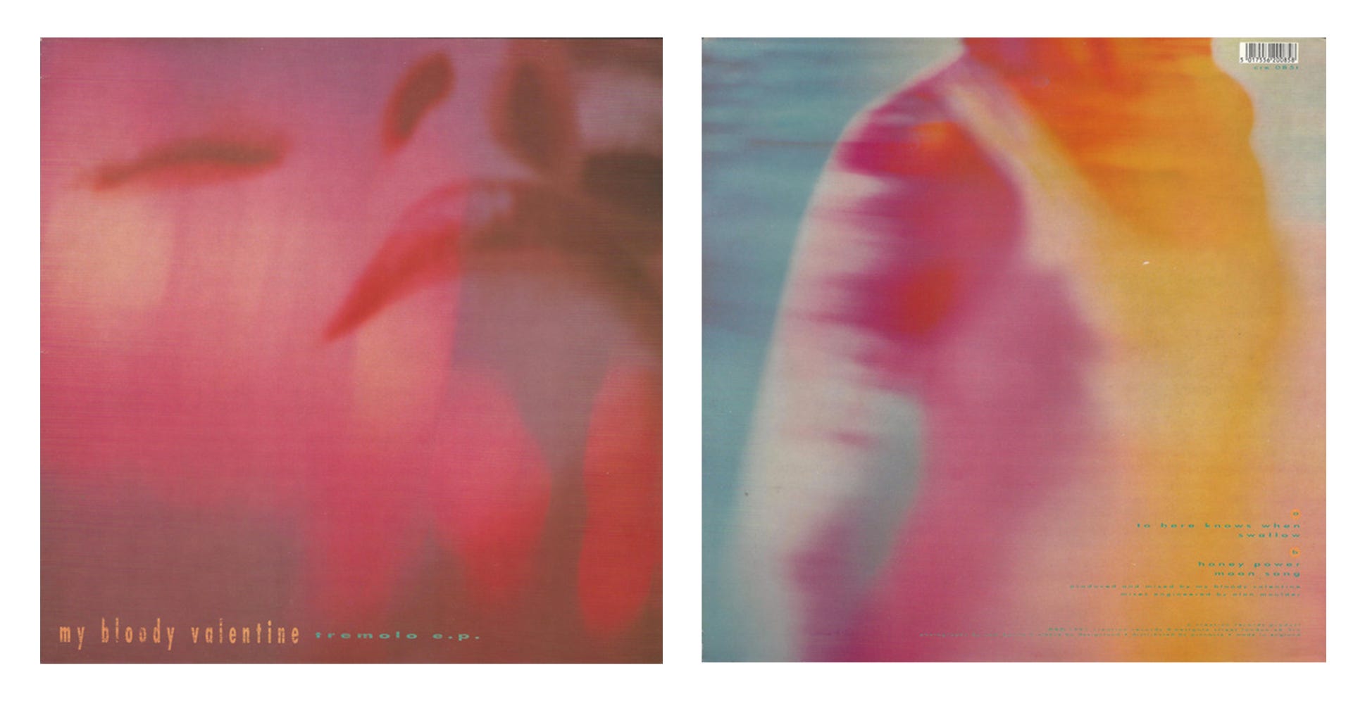

The artwork for MBV’s Tremolo E.P. is an abstract flood of color. On the front, a female-esque figure appears in a trance, eyes closed, head leaned back. Flares of light brush over the hot fuschia canvas, denoting a dream-like world. The bleeding colors continue onto the back cover, showcasing, what I assume, to be the female figure’s torso entranced in the same dream world. On 1991’s Loveless, hot pink fuschia appears once again, this time describing a vibrating guitar performance. It’s blurry, yet concrete in its visual translation of how MBV, and Shoegaze, sound.
If Pantone had a color of the year in 1991, it would’ve been My Bloody Valentine’s Fuschia. The color also appeared on Pale Saints’ Flesh Balloon, Hole’s Pretty on the Inside, and the Cocteau Twins’ Heaven or Las Vegas.
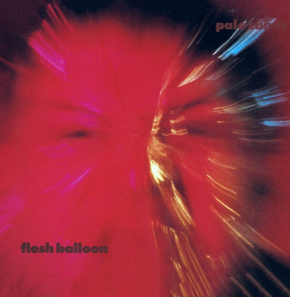
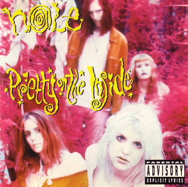
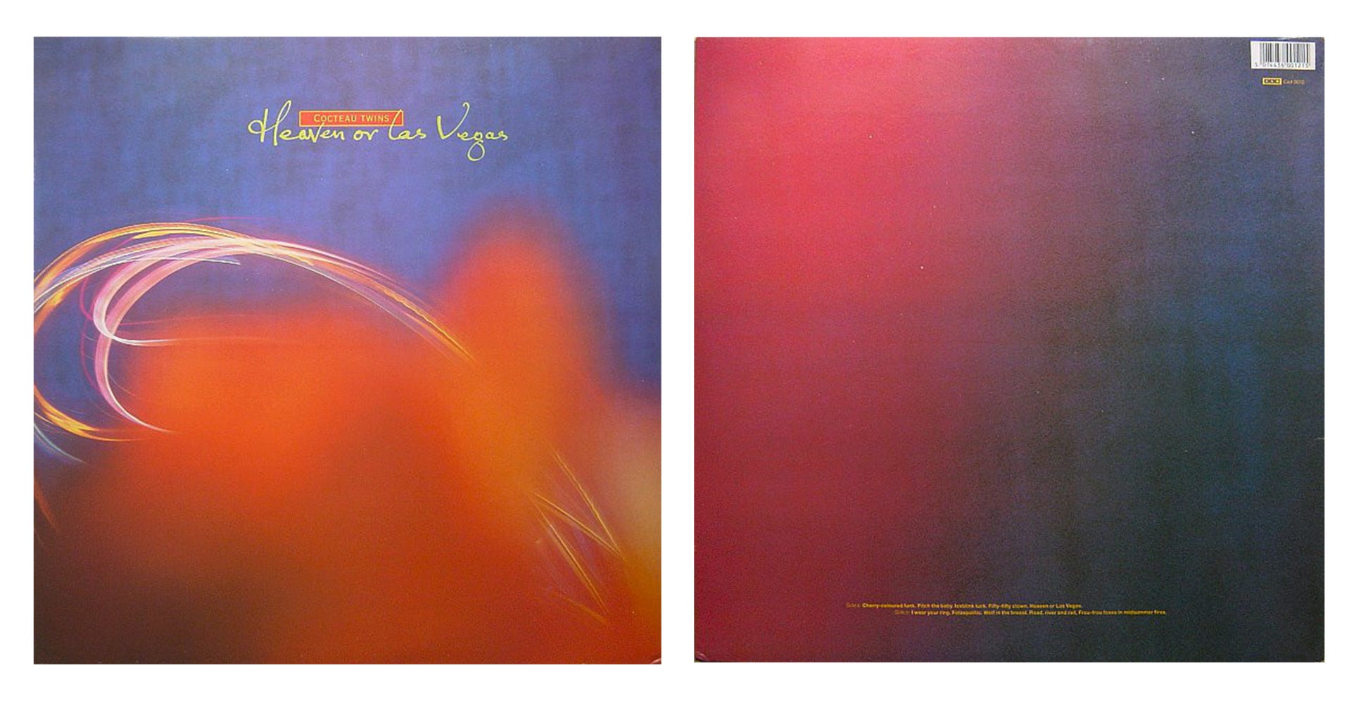
It isn’t just the deep pink tone that these three albums share, it’s also how the color is utilized. All of the covers are soft in both their texture and depiction of their subjects. The same way that Shoegaze sonically puts its audience in a hazy, distorted headspace, its visual artwork does the same.
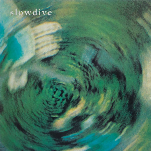
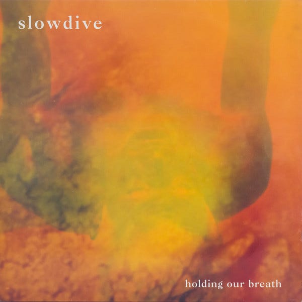
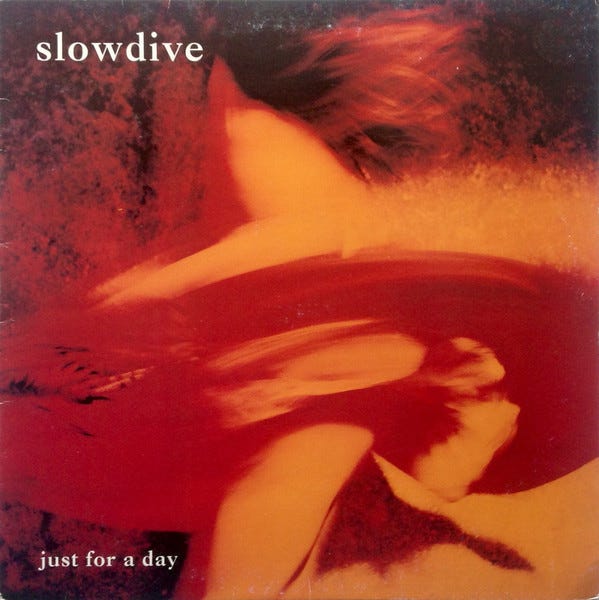
Fellow Shoegaze and labelmate to BMV, Slowdive, employed the same abstract aesthetic to their cover artwork. Formed in 1989, they released two EPs and an album between 1990-91. Through the lens of Shoegaze, their artwork is almost factory-like with the serif font and signature conceptual subject.
This may be an unpopular opinion, and go hand-in-hand with why so many bands hate to be defined within the realm of Dream Pop, but as a genre, Shoegaze might be the most cohesive, sonically and visually. Flip through any bin at a record store, and come across a fuzzy, soft, abstract color bleed of a cover, and the band has most likely pulled inspiration from a combination of psychedelia and ambient rock. But what’s not to like about that? The genre has succesfully created a world for its fans to recognize and get lost in.


I’m looking for The Art of Cover Art to be a free educational and inspirational source since there is little documentation on the art history of album art. But, if you have $5/ month to spare, it would be super helpful in furthering my research. Or if you think a friend might enjoy this newsletter, the best way to pay it forward is by sharing!