A Brief Visual History of Hardcore
Surveying the DIY aesthetic across the genre's 40+ year arc.
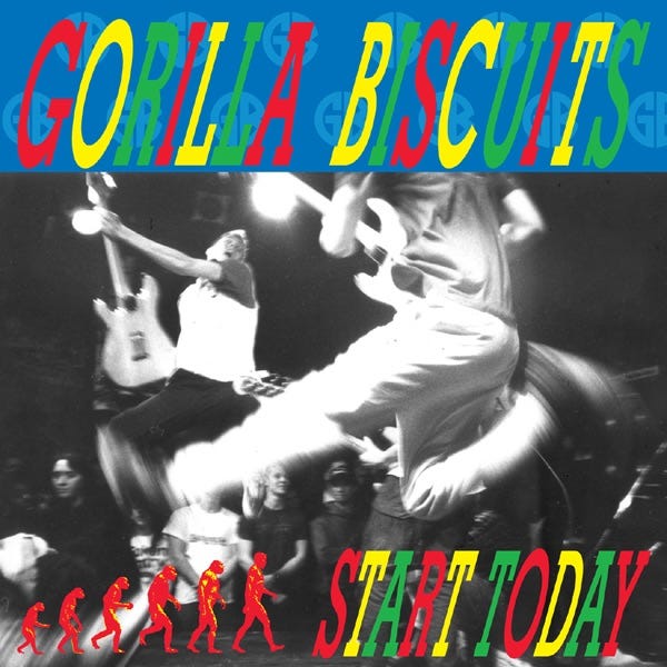
While no genre is limited to a certain aesthetic, trends create themselves over time. When it comes to Hardcore, a subsection of punk known for its strong community ties and experiential performances, a distinctive visual voice has lasted over its forty-year course, beginning in 1980. Writer Kelefa Sanneh wrote for the New Yorker in 2015, “Hardcore was born as a double-negative genre: a rebellion against a rebellion.” For once, New York was not the cultural epicenter of this movement. Communities instead sprouted in cities like Washington D.C. and Los Angeles around early hardcore groups like Black Flag and Bad Brains. It wasn’t until the groups Cro-Mags and Gorilla Biscuits came onto the scene that New York was included in the loop.
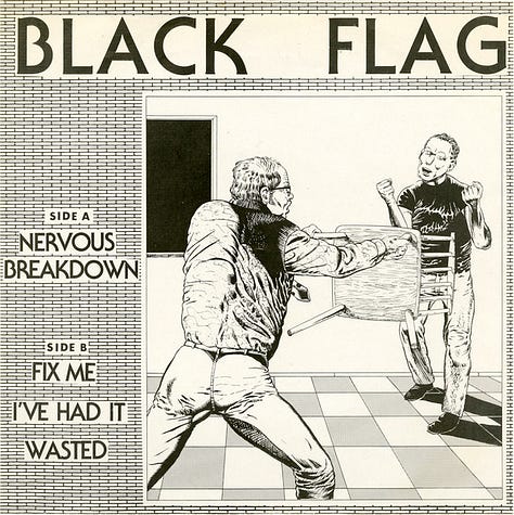

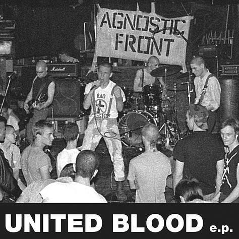
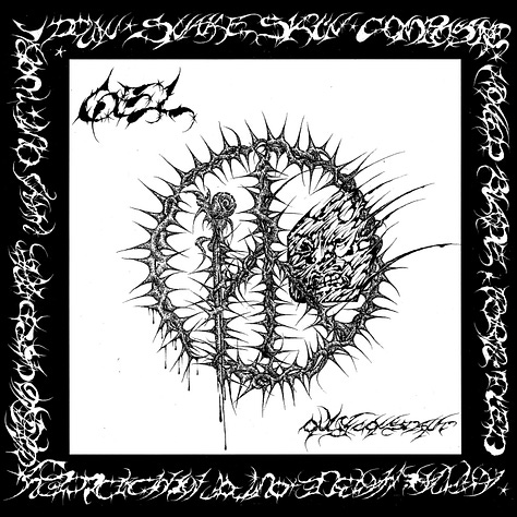
Looking at early hardcore covers like “Pay to Cum!” by Bad Brains, “Nervous Breakdown” by Black Flag, and “United Blood E.P.” by Agnostic Front, we see a chorus of black and white imagery, perhaps due to the cheap and DIY efficiency of not printing in color. Today, when flipping through record bins in the hardcore section, one’s eyes continue to be saturated by this early aesthetic forty years later, with bands like Soul Glo, GEL, and Trash Talk.


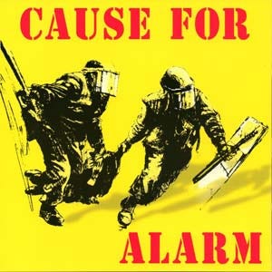
The layout design of the 1983 self-released issue of Cause For Alarm’s debut EP is also black and white in its entirety. From the fuzzy spray-painted-like text on the cover to the hand-written marker copy listing the tracklist, credits, and lyrics. To tie it all together, a cut-out collage of the crowd and an illustrated depiction of a cityscape gone to hell live in the insert. Its DIY ethos is apparent at its core.
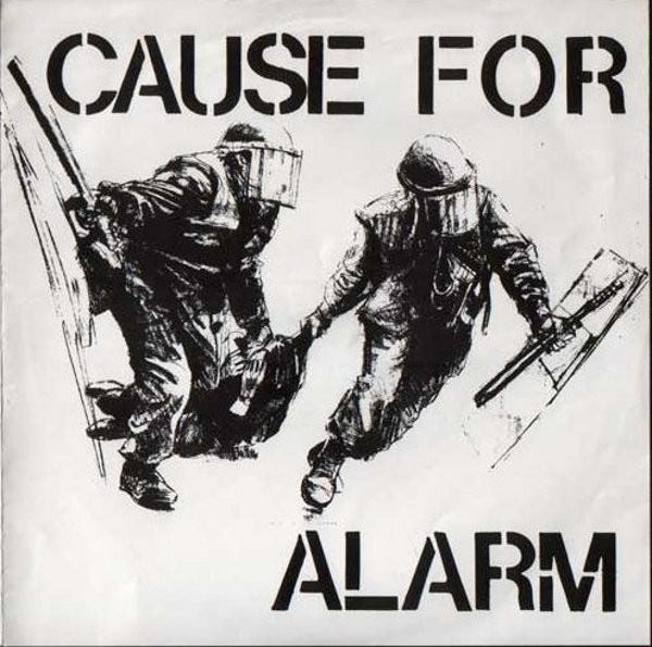
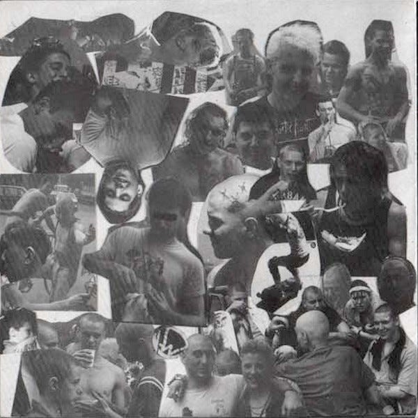
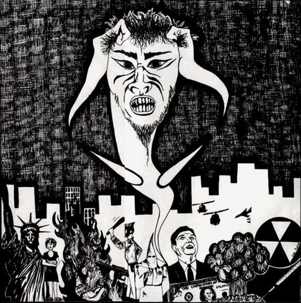

When the EP was reissued in 1994 on Victory Records, the label interestingly polished the cover with an unmistakable yellow and red palette, adding a photo of the band with neatly laid text on the back.

Like any underground scene, secret talent eventually gets out to the masses. This especially applies to Baltimore’s Turnstile, whose fourth album, GLOW ON released to critical acclaim in 2021 with three Grammy nominations for Best Rock Performance, Best Rock Song, and Best Metal Performance. In an interview over email, Dewey Saunders, the art director behind the visuals for Turnstile’s last three releases, describes the art history of hardcore as the “evolution of punk aesthetics, photocopy fliers, heavy and dense textures, in your face concepts.” For the cover and packaging for GLOW ON, “the idea was to create this super soft feeling package that contrasted with the stereotypes of hardcore visuals.” They spent weeks perfecting the pink that threads the campaign together.

For the cover for Turnstile’s 2018 LP, Time & Space, Dewey writes, “Brendan had me study Sun Ra records and videos. He wanted an otherworldy feeling to the art that was inspired by esoteric jazz recordings. The mysterious disco ball in the desert made this idea work really well. It feels timeless to me, being that it's black and white with gold surrounding the circle. We wanted to create an artifact that exists outside of our current culture.” Lastly, Saunders mentioned how Turnstile has “created a whole world that includes the album art and extends to merch, show photography, and general presentation. I feel like a lot of musicians should be looking at them for a prime example of how to showcase your sound within a visual universe.” Dewey also points to the cohesive visual worlds of Philadelphia’s Jesus Piece and Baltimore’s Angel Du$t.

When looking at other current hardcore acts, New York’s Show Me the Body can’t be missed. With the aid of visual artist siblings Asha and Elijah Maura, the three-piece has cemented themselves in the hardcore scene. On their last two albums, Dog Whistle (2019) and Trouble The Water (2022), a coffin symbol appears on both covers. The artworks are simply shot on what appears to be film, yet both images translate such a drastic point of view, another visual theme among hardcore art. Dog Whistle shot from high up on a helicopter, and Trouble The Water setting coffins aflame.

The cover art of the scene is yet another example of how the community ties hardcore music together, still harkening back to its predecessors. Find more hardcore on Album Whale and below.
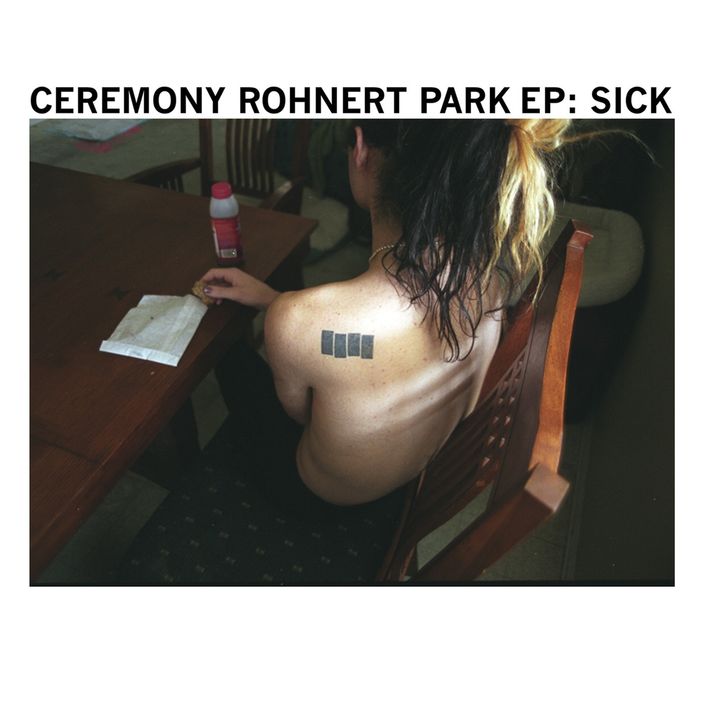

The Art of Cover Art is a free educational and inspirational resource. If you have $5/ month to spare, it would be very helpful in furthering my research. Or, if you think a friend might enjoy this newsletter, the best way to pay it forward is by sharing!


I could swear that I read somewhere that Bad Religion uses the font they do because it's the same one Black Flag used. Did you happen to see that anywhere? I'll have to keep digging to see if I can find it again.
Similarly, a lot of straight edge records from the late 80's/early 90's have a similar aesthetic as "Start Today" (for anyone reading this, that record is awesome). I have several records from those days with that same sort of "action shot from a show" photo on either the front or back cover- or both. Usually accompanied with a shot of the band sitting on a stairwell somewhere. Youth of Today's "Break Down the Walls" comes to mind first.
My favorite issue, loved the deep dive on hardcore. There is this cool book I have called “f*cked up and photocopied” that has a bunch of old LA hardcore/punk flyers and album covers. Highly recommend!